I'm Onogi from the design department. I've designed websites in a variety of genres, but in recent years I've been working more on "BtoB corporate websites." (Monosus has a sales team that specializes in BtoB .)
Due to their nature of catering to corporate customers, B2B companies are not something we come into contact with often in our daily lives, but many of them have world-class technology and they truly support Japan's manufacturing industry.
In this article, I would like to tell you about the things we pay attention to and the important points we consider when designing in order to express the appeal of a BtoB company.
The layout of the top page is almost decided. (Actually, I checked it.)
It may be an exaggeration to say that it is fixed, but I don't think it's too far off. It might be more appropriate to say that it is "content priority" rather than layout.
Because websites are scrolled from top to bottom and text is read from left to right, the layout priority is highest in the top left and lowest toward the bottom right. Therefore, content priority is decided and placed from the top left, but looking back at the B2B corporate websites I have worked on, I noticed that the layouts of all the sites were not very different.
We actually randomly selected 50 BtoB corporate websites and examined the layout of their top pages.
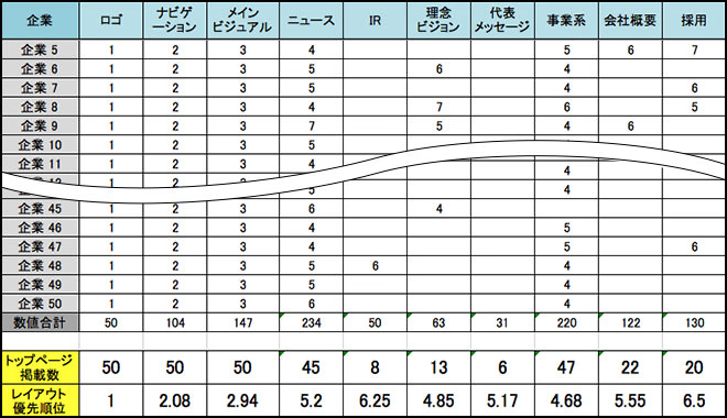
A summary table of 50 BtoB corporate websites. While looking at the top designs, we recorded the ranking of content elements to confirm the layout priorities.
Although there were some differences in content and priorities, the layout was in the following order:
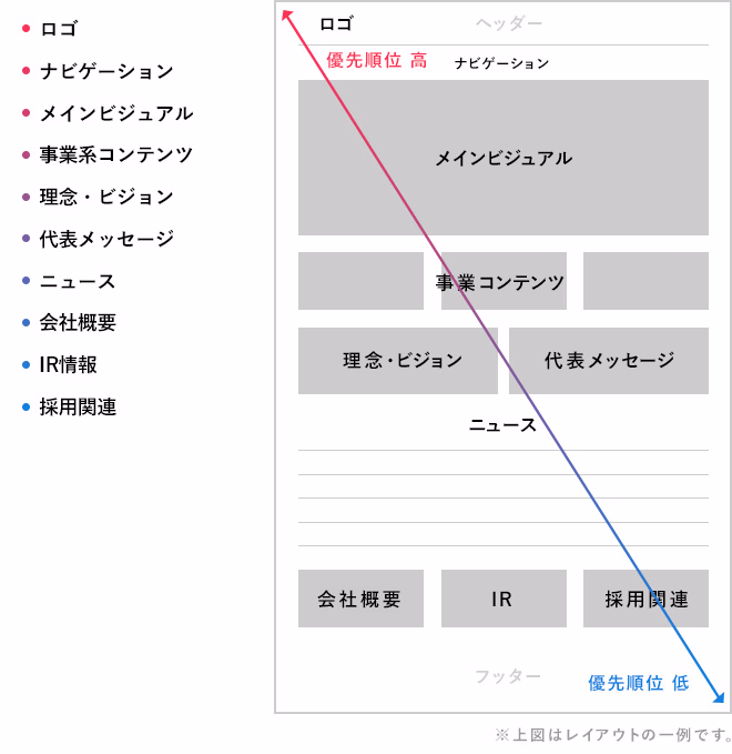
As you can see, the content and layout of the top page of a B2B corporate website is pretty much set in stone. So how can you differentiate your site?
Determine the first impression with "words" and "visuals"
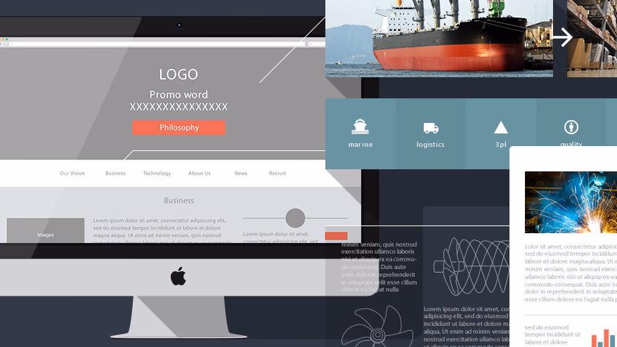
That's where the main visual becomes important. The main visual is the "face" of the website and determines the first impression of the site. Sites of any industry put a lot of effort into their main visuals, but I think the "power of words" is especially important for BtoB corporate sites.
"Words" refers to the catchphrase or message placed in the main visual. By succinctly expressing the company's philosophy and business activities in "words" and displaying them together with the visual, the company's personality and guidelines can be conveyed at a glance.
Why are "words" important on BtoB sites?
The reason for this is that the business is difficult to understand.
The services and products of BtoB companies are highly specialized and are sold and provided to other businesses, so they are not often seen in the general public. In order to intuitively convey a business that is difficult to convey with just the company name and product photos to a wide range of users (customers, financial institutions, government agencies, students looking for jobs, etc.) through a website, the "power of words" is essential.
Below are some examples of main visuals that place importance on "words."
Yanmar Group
https://www.yanmar.com/jp/
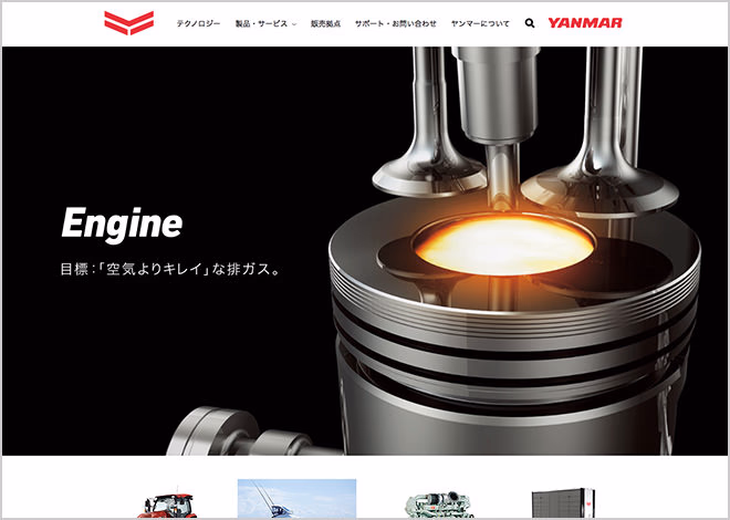
[Example of work by another company] In addition to the brand statement, each product category is expressed with copy and dynamic photographs, creating a main visual that conveys high aspirations and technical ability.
Fuji Kogyo Co., Ltd.
http://www.fujikogyo.com
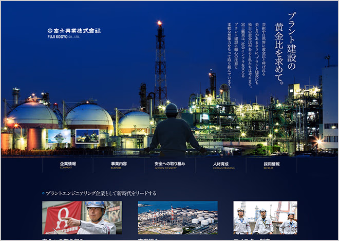
[Example of work by another company] Although the lead text is relatively long for a main visual, it is a persuasive main visual that is finished like a poster. The power of the photo and words makes it easy to understand the business content.
When actually designing, I shoot out various design options in my head and then implement them to ensure that the words and visuals produce the greatest effect.
Once you have created an impression of your "face" with these main visuals, it is important to communicate your "contents" (i.e. the business content). Therefore, we will focus on designing the "business content" that specifically introduces our technical capabilities and services.
Breaking down the business from various angles,
Visualization through design
Compared to BtoC sites, it is often difficult to understand the business content on BtoB sites. When you consider such business content as content, the key is to break it down into content that is attractive from various angles. Furthermore, it is very important to make it "visible" through design.
Of course, content can be created simply by talking about the business, but by changing the approach and featuring it from a different angle, you can create a three-dimensional business introduction. Also, by breaking it down, the role of each piece of content becomes clear, and you can then concretely think about how to present it effectively through design.
"How can I make my photos look bigger so that the details of my products are more clearly visible?"
"How can we create an interface that allows users to read the content that talks about our strengths in an orderly manner without getting lost?"
We will introduce some examples where incorporating such requests into the design and making them visible has made the content more persuasive and improved the site.
Eagle Industry Co., Ltd.
http://www.ekkeagle.com/jp/
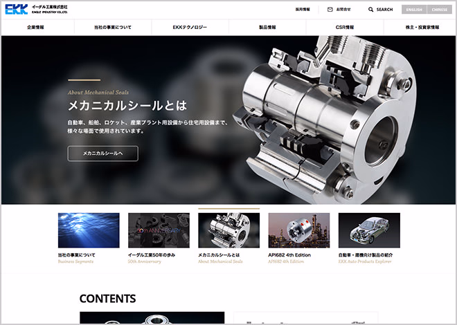
Divided broadly into three sections: "Overview," "Technology," and "Products," the report provides thorough coverage of the entire business, with particular focus on in-depth technology and extensive product search functions.
Ichiyo Dyeing Co., Ltd.
http://www.ichiyosenko.jp
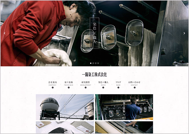
[Example of work by other companies] As a content that focuses on people, the content "dyeing" x "craftsman" uses video. The quality is high, and the way it is presented is emotional and traditional is very impressive.
Plus, something extra to take you one step further
Generally, BtoB corporate websites prefer designs that look "honest." However, on the flip side, sincerity can lead to a formulaic website. Since a website is the face of a company, we want to create a design that will be memorable to users.
Therefore, I refer to websites and magazines from different industries and try to bring in new ideas. There are times when I can't balance the direction of expressing sincerity, but through trial and error, something new often emerges.
This is the most difficult and challenging part, but it is also the joy of design and perhaps the part I enjoy the most as a designer.
Taguchi Industries Co., Ltd.
http://www.taguchi.co.jp
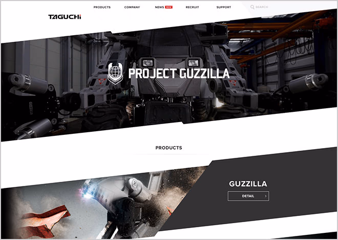
[Example of work by another company] The diagonal grid is unusual, but the photo processing is particularly impressive. The effect, which may seem excessive, gives a sense of the power of the machine and matches the characteristics of the product very well.
WEST inx Co., Ltd.
http://www.west-lock.co.jp
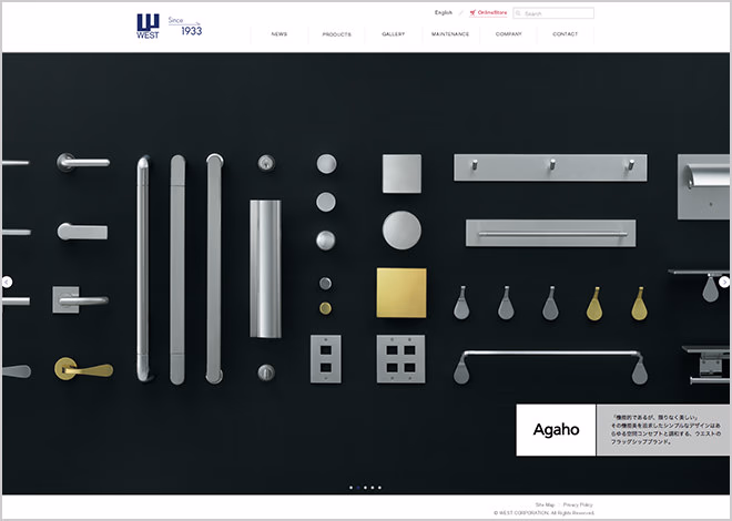
[Example of work by another company] A company that manufactures and sells locks and other items, which also does BtoC. The homepage, which has no catchphrase or content, only features iconic photos of the products, expressing their beauty and technical capabilities.
Also, from the B2B companies I meet recently, we've been getting more and more unexpected requests, such as "We want to do something new!" and "We want a cool website!", that go beyond the usual requests of "honesty" and "trust."
As time has passed since the stage of "creating a proper website" as was the case some time ago, and the range of things that can be done with web design has expanded, it seems that awareness of design is increasing throughout the B2B industry.
This makes me very happy. It's rewarding to design, and by receiving various opinions, I can think more deeply and learn a lot. I will continue to use the know-how I have accumulated to design to the best of my ability as a professional, so that my customers are satisfied.

モノサスアーカイブ