This is Maruyama from the Coding Factory Department.
This may be a bit sudden, but do you have any occupational hazards that you can't help but do because of the nature of your job?
The coders who work at Coding Factory code websites every day, and work hard every day coming up with ideas and worrying about coding.
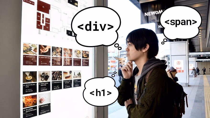
Perhaps because of this, there are quite a few coders who, when they see billboards or advertising posters around town, start coding in their heads, thinking, "I'll surround this with a div, and this will be a heading, so I'll use h2...no, h3..." lol.
When I started working as a coder,
"Even seeing train advertisements creates coding in my brain."
I didn't really get it when I heard that word,
On my way home from work, I was staring blankly at the Shinjuku Station map when
"This is a heading module, this is a list of card-type modules... Ah, I can put this together (as HTML)!"
I started to think about it, and I found it interesting that I was beginning to understand the meaning of the words. Then I wondered what would happen if I actually tried coding .
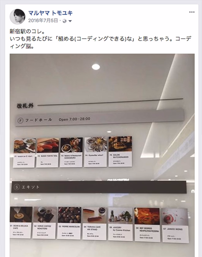
Last year, Maruyama tweeted this on Facebook, and took a photo of a guide map that could be coded at Shinjuku Station.
So this time, I'd like to take a walk from Shinjuku Station, which I use for my daily commute, to my office and code the scenery and things I find.
1. Shinjuku Station: Retail store guide map
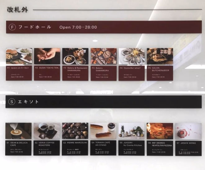
This is a guide map with information about food shops in the station, located next to the bookstore near the Koshu Kaido ticket gate (formerly the Southern Terrace exit) at Shinjuku Station. All the food looks so delicious that it will make your mouth water.
The design is simple and resembles the flat design that has become the standard recently, making it easy to code in your mind.
The module structure is as follows, from top to bottom: "Header Module"
Heading module
"List module + card type module"
Is that the structure?
So now let's start coding.

See the PenCoding of Street Scenery 01 by Tomoyuki Maruyama ( @tomoM ) on CodePen .
The coding content is as shown in the source code above. (For detailed source code, please see Codepen.)
Since it is a guide map, there should be an order to the importance of the information being conveyed.
Therefore, just like with normal websites, we paid attention to the heading levels, and did not consider business hours and identification numbers such as F1 and S1 to be heading content, so they were not composed with h1 to h6 elements (they were composed with p elements, etc.), and we used CSS to make the appearance consistent.
(Orange part of the image: coded with h1 to h6 elements, light blue part of the image: coded with p elements)
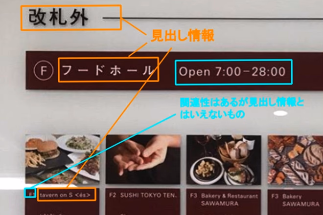
In addition, because the color of the parts differs depending on the floor information, we created a common class name and set a common CSS style, and the difference in color can be adjusted by adding a class name with a modifier as a second class. (The class name in red in the box below)
<header class="ttl-shopinfo ttl-shopinfo--foodhall ">
<h2 class="ttl-shopinfo__title">Food Hall</h2>
...
Card type (wine color)
<div class="card-shopinfo card-shopinfo--foodhall ">
Heading (black)
<header class="ttl-shopinfo ttl-shopinfo--ekisoto ">
<h2 class="ttl-shopinfo__title">Exoto</h2>
...
Card type (black)
<div class="card-shopinfo card-shopinfo--ekisoto ">
In addition, when it comes to icon information next to headings such as Food Hall, we assumed that there might be cases where that element is not present, and we thought that deleting the second class would make the heading justified to the left.
When creating a website, there are times when you might think, "There are only patterns that exist in the design, but in fact, we also needed patterns that didn't exist in the design!" So the ability to anticipate patterns may be important.
Key points
- To increase versatility, the wine-colored and black headings and card-type modules have the same base, and differences due to different colors are classified by Modifier (responsible for appearance and state such as color).
- It is designed to take into account the case where that element is not present, so that it can handle any situation.
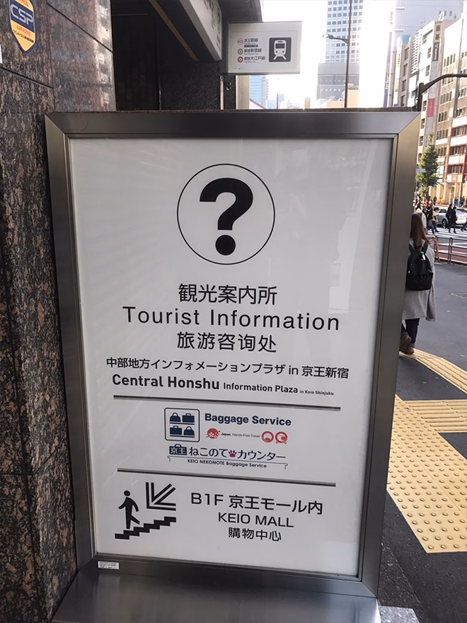
2. Koshu Kaido: Tourist Information Center
Now, leave Shinjuku Station and walk along Koshu Kaido.
The next thing I found was an information sign telling people the location of the tourist information center, as shown in the image above.
Whereas magazines and advertisements (and sometimes web pages are like that too...) are designed with an emphasis on how much information they can pack into them, it seems to me that guide maps, which are viewed by a wide range of people, tend to have a simple design so that anyone can read only the important information.
I appreciate the simple design because it makes it easier for me as a coder to design information.
The module structure depends on whether or not you consider question marks to be meaningful, so it's a difficult decision to make.
In this case, we will assume that the icon itself does not have any structural meaning, and will display it using CSS without displaying any information in HTML.
Therefore,
Heading module
"Text module"
"Image module"
"Image + text information combination module"
I will continue coding with this in mind.
See the PenStreet Scene Coding 02 by Tomoyuki Maruyama ( @tomoM ) on CodePen .
The coding content is as shown in the source code above. (For detailed source code, please see Codepen.)
It was difficult to prepare the logo image and the icon of going down the stairs, so we were not able to reproduce it perfectly, but
I think I was able to expand on the coding image from the photo and somehow give it some shape.
When I thought about "What is the most important piece of information this time?" I thought it was probably the "tourist map" section, so I made this the headline.
However, if we made Japanese, English, and Chinese into H1 each, we would end up with multiple equivalent headings, so we decided to group Japanese (ja), English (en), and Chinese (ch) together with span within a single H1 as shown below.
Key points
- We have devised a way to group together the headings in Japanese, English, and Chinese.
Disappointing points
- We were unable to reproduce parts that required design creation, such as logos.
3. Koshu Kaido Underground Route Shinjuku Station Area Guide Map
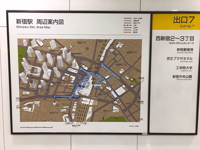
Follow the signs, go down to the basement and go underground under Koshu Kaido to reach the company.
I find this route quite useful as it allows me to commute comfortably from Shinjuku Station to near my office on rainy days, hot summer days, and cold winter days.
Well, halfway through the underground route, I found something that looked like it could be coded.
Look at this photo,
"Two columns"
"Main content and side navigation."
"The map is Google Maps..."
If you agree, you've passed. Welcome to the world of coders.
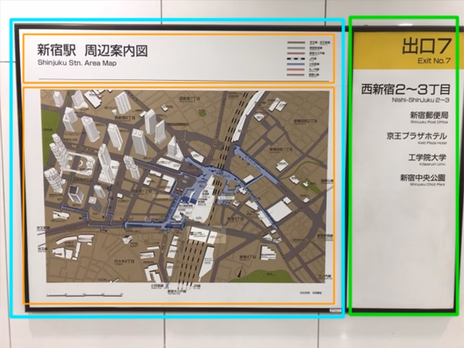
Since there are a lot of elements this time, I would like to think of this as a page.
Divide the wider elements on the left into main content and the elements on the right into side content. (See the light blue and green borders in the image.)
The main content will be further divided into a heading frame (mod-guidemap__heading) and a content body frame (mod-guidemap__body) to improve visibility. (See the orange border in the image.)
See the PenCoding of Street Scenery 03 by Tomoyuki Maruyama ( @tomoM ) on CodePen .
The coding content is as shown in the source code above. (For detailed source code, please see Codepen.)
In this case, there were no logo images or anything that would be difficult to reproduce, so I did my best to recreate it as well as possible.
Of these, the thing that gave me the most trouble was how to express the list of stations to the right of the "Shinjuku Station Surrounding Area Guide Map."
It's hard to tell from the photo, but the border actually consists of two lines.
This was reproduced using the ::before pseudo element with border-top and border-bottom.
There may be other ways to express it, such as using the double border.
Also, representing JR lines is quite tricky, and if you simply use the dashed or dotted border, you won't be able to control the spacing between the black and white.
Therefore, I used a linear-gradient to create a dashed line and then repeated it.
Key points
- The borders of the lines in the list of stations next to the heading have been reproduced using the ::before pseudo-element.
summary
This time, I walked from Shinjuku Station to my office looking for things that I could code.
In the process, I began to notice that even on the roads that I pass by every day without even thinking about it, there are advertisements, signs, and objects with a variety of designs.
Also, information displayed on signboards in public places such as stations is often simple, which made me realize the importance of information design. I felt that I could use this knowledge to improve the coding and code design of my own website, which was a great learning experience.
In terms of coding,
"The structure is messy, but I'll recreate it by using p and span (I remember someone who recreated Doraemon and Pikachu using only HTML and CSS was a big hit on the Internet)"
I was unsure whether to go in the direction of "reproducing the document structure and design in the same way as the parts of a website," but this time I decided to go with the latter approach.
After I decided on the topic, there were some parts that were difficult to code and gave me some headaches, but even with that it was a lot of fun.
Also, while designers often get inspiration from magazines, objects in the city, and advertisements and use that inspiration to improve their own sense, I recommend coders also try to imagine what objects they see in the city would be like, how they would put them together, and what CSS properties they should apply to make it work, as this can be quite a good form of training.
After reading this article, why not try looking for a cityscape where you could code and let your imagination run wild?

MARUYAMA TOMOYUKI
It's been more than ten years since I moved to Tokyo from a rural town in Oita Prefecture with a passion for the "Web" ..., I have almost entered the realm of a seasoned veteran but still learning every day. My appearance is starting to look like a veteran, so I'd like to lose weight and work on anti-engineering.