Hello. I'm Onogi, the head of the design department.
I've been working in web design for about 10 years now.
In all my design work, there have been many occasions when I needed illustrations or icons.
Nowadays, there are many services that allow you to download stock photos and icons, but I still think that if you want to express originality or the subtle nuances that match the site, the best way is to actually draw it.
I am not a professional illustrator, but I have drawn a variety of illustrations through web design.
This time, I'd like to use that experience to introduce some things I pay attention to when creating illustrations.
Anyway, decide on a rough direction.
If the decision has been made to insert an illustration, the tone and manner of the publication medium will probably already be decided to some extent.
For example, if you are looking at the homepage of a cosmetics company, keywords that immediately come to mind are "clean," "luxurious," and "cute," but when it comes to adding illustrations to match these, it would be strange to use manga-style illustrations.
Such a campaign might be interesting.
So, I think it's a good idea to first select a few illustrations from magazines, the web, etc., and then line up some that have a similar theme but are slightly different to grasp the subtle nuances.
First, try drawing one
I think it's a good idea to draw at least one to get the client's approval.
Even if you try your best to get as close as possible to the nuances your client has in mind, your own subtle "quirks" may come out.
While this may be a good thing, it may also result in something that is different from what the client had in mind.
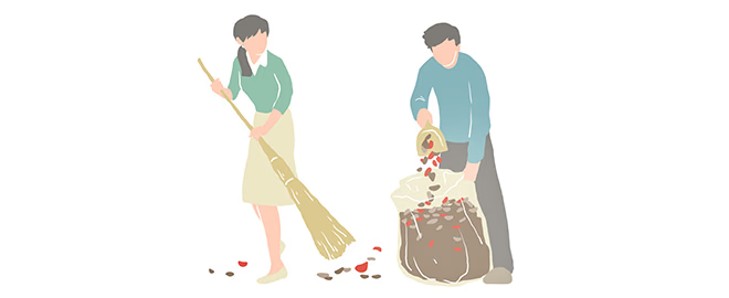
This time, I will use as an example an illustration I created when renewing the Monosus website.
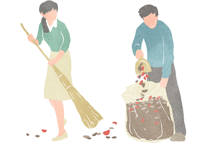
The first illustration I drew to decide on the tone was the cleaning scene shown above.
Here is the finished product. I drew it in Photoshop.
Points to note when laying out: "Lines and fills"
It took a lot of twists and turns to decide on the tone and manner of the above illustration. The most troubling thing was the thinness of the lines and the darkness of the paint.
We actually lay it out in the design and determine whether it works as an illustration.
This is because even if a picture is complete with just an illustration, it is not certain whether it will work as a design.
For example, the following intermediate patterns are possible: The left one has a slightly thicker line, and the right one has a lighter fill.
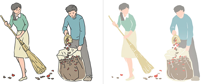
This illustration is intended to be used at the bottom of a page to add a little flair.
You can see this clearly when you actually try to create a layout, but if there are lines like the one below, the illustration becomes too strong and the eye is not drawn to the original text.
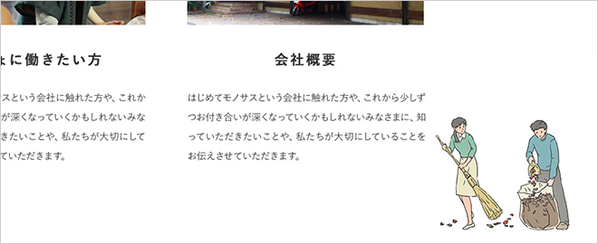
If the paint is thin, it will blend in with the white background and function as an illustration, but it will end up looking blurry and unfocused.

There are various ways to go about this, such as making the lines thinner or changing the colour itself, but for this Monosus site I decided to eliminate the lines and adjust the paint so that it wasn't too thin.
Add a little something
I could continue as is, but since this is a hand-drawn looking illustration, I decided to make the most of that by adding a bit of noise and color shading to give it more character.

Layering a noise texture (left) and a shading texture (right) to create a hand-drawn look.
This time I posted a rough outline of the process I follow when drawing an illustration.
Nowadays, the work related to web design has become more and more specialized, and it seems that there are fewer web designers who draw illustrations.
In the past, there were few stock photo sites or websites where you could download icons, so I think it was one of the skills a web designer needed.
In these times, why not reconsider using illustrations and icons to add a touch of elegance to your designs?
*The "PSD file" of this illustration and the "watercolor-style brushes" are uploaded below as samples.
Please feel free to use it.
Reference illustration PSD data (20151110_illust.psd)
Watercolor style brush (20151110_brushMura.abr)
