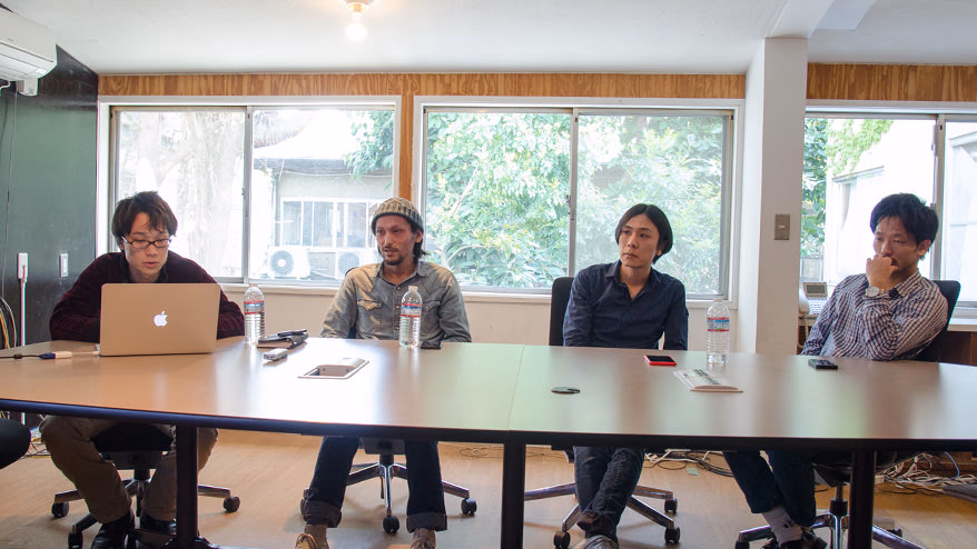
Hello, I'm Shizuha, a designer.
Currently, there are six designers in the design department, and they have a wide range of careers. Some were originally Flashers (Flash creators), while others moved from completely different industries. Their experience as web designers varies from a few years to over 10 years.
With web design itself changing at a dizzying pace, what perspectives do our members have when looking at websites? In this "Design Team Roundtable," we decided to have each member present a website that has influenced them or left an impression on them, and share their perspectives with each other.
*For the sites that have already been renewed or closed, we used the web archive browsing service " Wayback Machine ." By simply entering the URL in the dedicated search box, you can view sites that existed in the past, so you can talk while actually looking at the sites that each person introduces.
- Presented by: Yu Onogi -
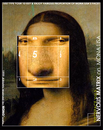
"Mona Lisa" is a Flash work by Yugo Nakamura from 1999. It seems that ActionScript was used, which was also applied to Morisawa Inc.'s corporate website around 2002.
 Onoki
OnokiThe sites I would like to introduce are "Mona Lisa by Nakamura Yugo" and " 2Advanced Studios ."
First, "Mona Lisa by Yugo Nakamura" is not a website but a Flash work.
When I was just starting out as a web designer, I saw Nakamura Yugo featured in an overseas magazine that featured Flashers from around the world and became interested in him.At the time, Flash was still in its infancy, with few people who could write ActionScript and no solid object-oriented programming. In those days, a work appeared in which the Mona Lisa's face distorted when clicked, and I was amazed by the idea and technology. "Flash can do so many things! Yugo Nakamura is amazing!"
When I was working as a flasher in my previous job, ActionScript was version 2.0, and when I was creating a script using a photo of a colleague, my boss told me, "Don't play around with other people's faces! Use your own face!" It's a good memory (laughs).
Next up is " 2Advanced Studios ," a site from the time when the speedy IT feel was popular.
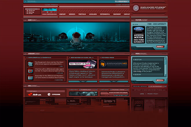
2Advanced Studios ( http://www.2advanced.com/ ) Corporate Site Ver.4.0
 Imai
ImaiThis site is nostalgic!
 Kamimori
Was this also about 10 years ago?
- Onoki
That's right. The design of Ver. 4 was so exciting and reminiscent of a movie, it left a strong impression on me.
 Shinba
Looking at today's flat design, this design is unimaginable.
- Onoki
At the time, Flash sites that gave off a futuristic, speedy feel were all the rage. This design and movement was a pioneer, and was featured in many summary sites and articles.
I studied this site and its overlay collages and visuals that give a sense of the mysterious interplay between light and objects. I think the influence of this site is quite evident in the design of a university website that I worked on recently.
- Imai
That's true. It does have a technical image to it.
- Shinba
Recently, I have had fewer opportunities to create designs like this, so it's not easy to take on the challenge, but it seems like it could be applied to technical sites.
A shocking illustration that also influenced the old Monosus site
- Presented by: Tomoya Imai -
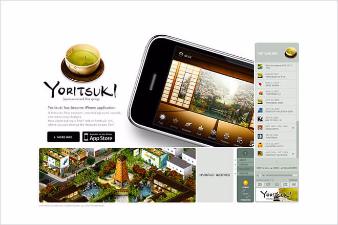
The website of HYBRIDWORKS inc. ( http://www.hybridworks.jp/ ), a small but elite team of designers and app developers.
- Imai
The first one I have is a Flash site, from a company called HYBRIDWORKS that influenced me when I joined the company (about 10 years ago).
At the time, Apple's UI was said to be the best, and skeuomorphic icons with realistic details were popular. As you can see from the tea icon, the use of color and the detailed writing were very beautiful and shocking. Even now, I am moved when I look at it again.
At that time, Ono and I were the only designers at Monosus, and we were inspired by the pixel art on this site and even drew illustrations for the Monosus site together.
- Shinba
This was published in a collection of rejected illustrations on the old Monosus website.
An illustration created for the service page of the old Monosus site. It was ultimately rejected. It is currently archived in the old site's rejected links collection.
- Imai
Nowadays I often create flat icons, but back then I used sites like this as reference to create icons with a rich feel.
- Onoki
I used this site to create icons and learn how to add textures...I used it as reference, but deep down I was thinking "I'm better at this" (laughs).
- Imai
I think this website represents the pinnacle of skeuomorphism. The ideas are great, and the illustrations are at such a high level that I wonder if even foreign creators could draw them.
- Onoki
I also created icons for the Coding Factory website in this style, but it was quite a challenge. However, since all websites are similar in style these days, it might be a good idea to actually incorporate it into your design instead of just reminiscing about the past. Is flat design really okay for everything? It makes you wonder.
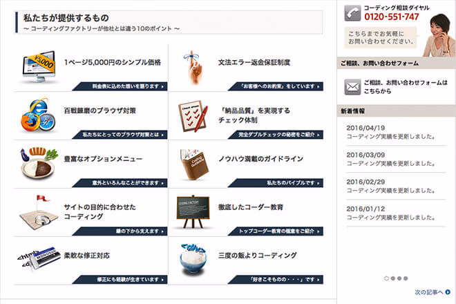
The icon used on the Coding Factory website ( http://coding-factory.com/ ), which says it was inspired by HYBRIDWORKS inc.
- Imai
The second is an HTML site, an article site called "BLOG×WORLD ENDING."
Unfortunately, it is now closed, but it was the best article site. The creator who ran it had already adopted HTML5 when it was recommended and animations could be created with CSS. I think all web designers in the world were looking at this site.
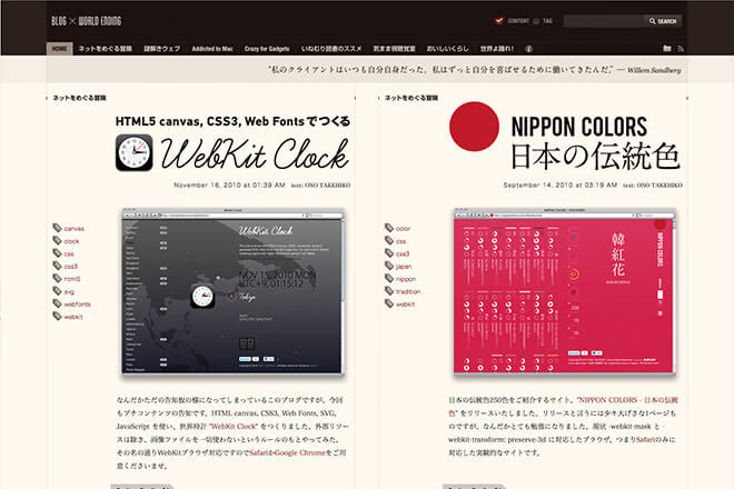
The best article site. Blog site BLOG×WORLD ENDING. It is currently closed.
- Onoki
The title before the article also had well-constructed typography.
- Imai
The layout was also beautiful. It was made by a member of a production company called Aguije, who is a designer and can do both front-end and back-end work.
An experiential website where your own illustrations dance!
- Presented by: Taku Kamimori -
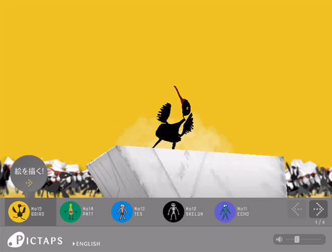
The service screen for PICTAPS ( http://roxik.com/v/0/ ). This web service was created by web designer Masayuki Kido, and allows you to make illustrations you draw on the screen dance.
- Kamimori
" PICTAPS " is a website from about 10 years ago, and it was innovative that the pictures I drew would dance to the music. At the time, computers were only used for playing with typing software or gathering information, but I thought, "What I made will move on the browser!" It's similar to the works of " Team Lab " today.
It was also refreshing and interesting to be able to share what I had made myself.
- Imai
It was a novelty at the time.
- Shinba
That's interesting! When I have time, I'll try to draw them and make them dance.
Bascule's website features memorable and bizarre illustrations
- Introduction by: Shinba Masumi -
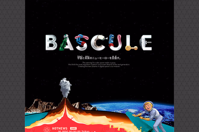
Bascule Corporation ( http://www.bascule.co.jp/ ) corporate website
- Shinba
The site that influenced me was the site of a production company called Bascule .
About 10 years ago, a childhood friend of mine who was a graphic designer and lived with me told me about this site, saying, "There's an interesting website."
At that time, I didn't think I would become a web designer, so I didn't have the perspective of designing a website, but I remember being impressed by the freshness of vertically long websites, which were rare at the time, and the impact of the illustrations and gimmicks.
What I found particularly interesting was when you clicked on the illustration of a vase at the bottom of the page, the whole site was sucked in. I remember being amazed that something like that was possible.
- Imai
I've seen it too. It's a design from the heyday of Flash, but this vertical design is still relevant to modern designs.
- Kamimori
How old is the design?
- Shinba
The site appears to have been around since 2001.
After the roundtable discussion
This was a roundtable discussion where participants talked about the websites that influenced them. They learned about each other's memories and perspectives, and had the opportunity to look back on the evolution of web design.
When I started working on web design in 2012, iOS was becoming more commonplace and flat design was becoming mainstream. However, even back then, I was still learning how to add gradients and shadows to buttons, and how to create main visuals and banners in Flash, so I think it was a time when trends were changing.
A few years later, Flash is no longer used, and the trend is to use animations and videos made with CSS and JS; things have changed rapidly. As I listened to everyone's presentations, I was once again amazed at how quickly things have changed, and overwhelmed by the freedom and attention to detail of past websites. (I wish I could have experienced the dawn of web design back then.)
I think that web design will continue to change at a faster pace than ever before. In this fast-paced world, this roundtable discussion has given me the opportunity to keep my mind focused on creating "memorable websites."

モノサスアーカイブ