Hello. This is Hamabata from the design department.
Do you like jazz?
After graduating from high school, I went on to music school, and for some reason I chose jazz as the piece I had to play for the entrance exam, and I've been listening to jazz ever since, for about 20 years.
The music school I attended had a curriculum based on jazz theory, so jazz was naturally something I was familiar with. I played the bass, and I think I often did jazz-like sessions with my friends at the time.
Then, when I was in my mid-20s, I started making graphics for fun, and I realized something.
The jazz artwork is so cool.
Black and white photography, typography, that big, impactful feeling...
So, for this design, I would like to focus on the work of Reid Miles, a leading figure in jacket design who has been responsible for numerous artworks for the jazz record label Blue Note Records (hereafter referred to as Blue Note), and introduce some trivia that jazz fans will already know.
By the way, Reid Miles was responsible for most of the artwork for Blue Note's most famous albums, those produced with production numbers in the 1500 and 4000 series, and a young Andy Warhol even drew illustrations under his direction, so he is quite a legendary figure.
So, I'd like to introduce some of my favorite artwork by Reid Miles.
Dancing typography symbolizes a passionate groove
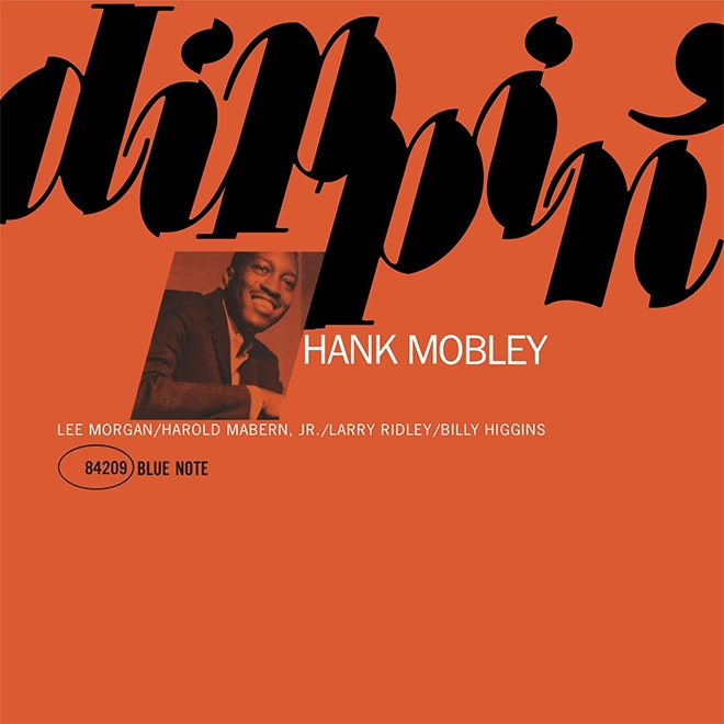
Dippin / Hank Mobley

Hank Mobley "Dippin" Universal Music (2014/12/3) ( Amazon )
Let's start with the artwork for tenor Hank Mobley's classic album "dippin'."
The reddish, cheerful color scheme and dancing typography are symbolic of this work, which contains a light-hearted yet passionate groove. The photo arrangement is also exquisite.
Even people who don't know much about jazz feel a certain jazziness in this design pattern of monochrome photography and typography. This style was born because of budgetary reasons that meant full color could not be used and only monochrome was possible, but now it has become the standard style.
A cool and bold string of numbers accompany the down-to-earth performance
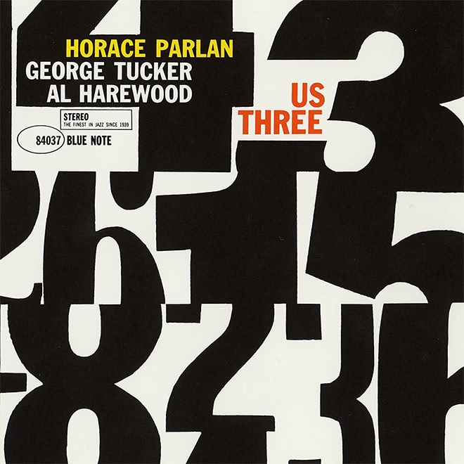
Us Three / Horace Parlan

Horace Parlan "Us Three" Universal Music (2014/12/3) ( Amazon )
This is also a great album. I don't know if Horace Parlan's "Us Three" is pushing the numbers to the forefront because the album title is "Three," but the bold composition of only typography still hasn't faded at all. The sense of trimming the numbers, the way the visual rhythm is taken... the artwork is so cool, but it's intensely electrifying when combined with the rough, earthy, and super groovy performance.
A perfect balance created by blue margins
Volume 1 / Sonny Rollins

Sonny Rollins "Volume 1" Blue Note Records (2003/7/18) ( Amazon )
Next up is Sonny Rollins' first Blue Note album. The F minor blues "Decision" and the impressive artwork with plenty of blue and white space seem to define the mood of this melancholy album.
It may be commonplace now, but the vertical English text was a very bold layout when this album was released in 1956, but it has been turned sideways in the reissue, which is quite disappointing... The spacing is also unique, with a large margin on the left side that creates an excellent balance.
This kind of balancing act may seem easy at first glance, but it's actually incredibly difficult to achieve.
A timeless sense of balance
In'n Out / Joe Henderson

Joe Henderson "In'n Out" Blue Note Records (2006/8/21) ( Amazon )
Next up is Joe Henderson's "In'n Out."
The typography of "in" and "out" intertwined seems to represent the great duo of tenor saxophonist Joe Henderson and trumpeter Kenny Dorham, who also participated in this album. This design uses typography all over the surface, in addition to the technique of placing the artist's photo small as part of a letter or figure, which is often seen in Reid Miles' works. Generally, if you leave some space at the bottom of the surface and put weight on the top, it tends to become unstable, but Reid Miles is a master of white space. His sense of balance is truly amazing. This work was released in 1964, but it doesn't feel dated at all even when you look at it now. I'm sure it was also used on Uniqlo T-shirts, so many people may have seen it.
The use of photography, typography, and spacing are all instructive.
Perfect layout for visualizing your guitar work
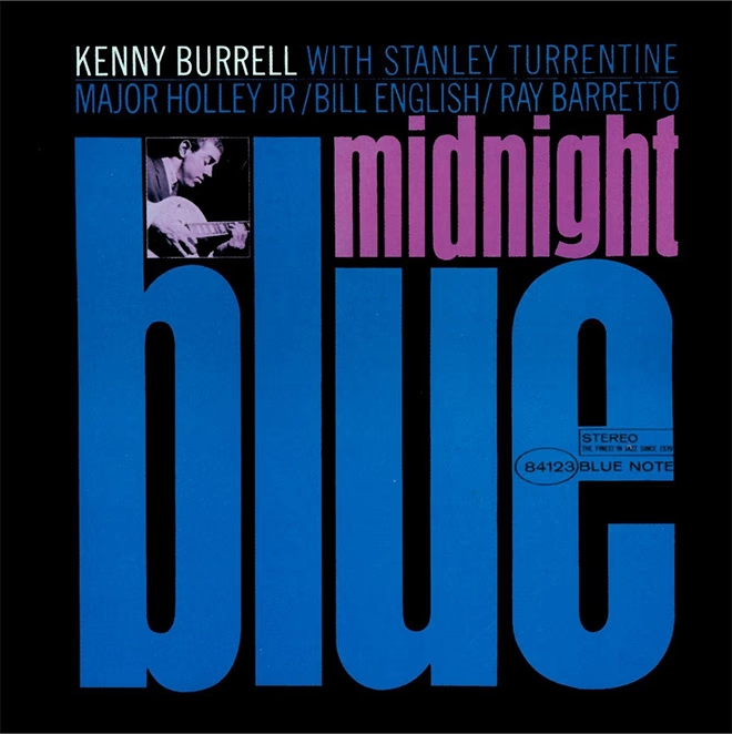
Midnight Blue / Kenny Burrell

Kenny Burrell "Midnight Blue" Blue Note Records (1999/2/4) ( Amazon )
Finally, here is the artwork for Kenny Burrell's "Midnight Blue," a famous Blue Note album (although all the albums I've introduced above are also great albums...). This is my favorite artwork, and it perfectly visualizes Kenny Burrell's super erotic guitar work. The color combination, the artist photo cropped and positioned at an exquisite size, and the perfectly laid out typography are all flawless.
It's a well-known story that Reed Miles wasn't particularly interested in jazz, and instead sold the records he received as samples from Blue Note and used the money to buy classical records. In that sense, it could be said that Reed Miles' lack of attachment to jazz led to the creation of his free and original designs.
Why not try listening to music with artwork in hand?
So, that was a very brief introduction to Reid Miles' artwork. Wow, it's really cool.
Nowadays, most of my contact with music is through data, so my connection with artwork is weak, but when I was a teenager, I would imagine a world of sound from the artwork, and my fantasy world would expand, and dopamine would be released. That's how I listened to music, so the position of the artwork in music was quite important to me, but what about you?
Sometimes, instead of using iTunes, it's nice to pull out the CDs or records that have been stored away at the back of a shelf, pick up the artwork and get in touch with the music.
See you later.

