こんにちは。デザイン部の中庭です。
担当するお仕事はWebデザインが主でしたが、今はものさすサイトの編集長も兼務ということで、業務が多岐にわたります。
そんな中、デザイナーの立場でも編集長の立場でも気になるのが、いろんな媒体の「文字」のデザイン。一言で「文字」と言っても、デザイナーとしてはいろんなことを考えなければなりません。「文字の可読性」「文字の絵としての見栄え」「文字の意味として見栄え」「文字と絵の関係性」などなど。
また、露出する場所の違いでも見せ方が変わります。紙とWebの間でも違いますし、同じ紙の中でも、雑誌のなのか新聞なのかでも違う。Webであれば、コーポレートサイトなのかWebマガジンなのか、はたまたニュースサイトなのかでも変わってきます。
そんな、語るとつきることのない「文字」のデザイン。今回は特に日本語の特性や文字組みについて、自分の頭の中の整理のためにも、お伝えしてみよう思います。
多様なキャラの組み合わせを楽しむか
合理的で便利な文字組みを求めるか
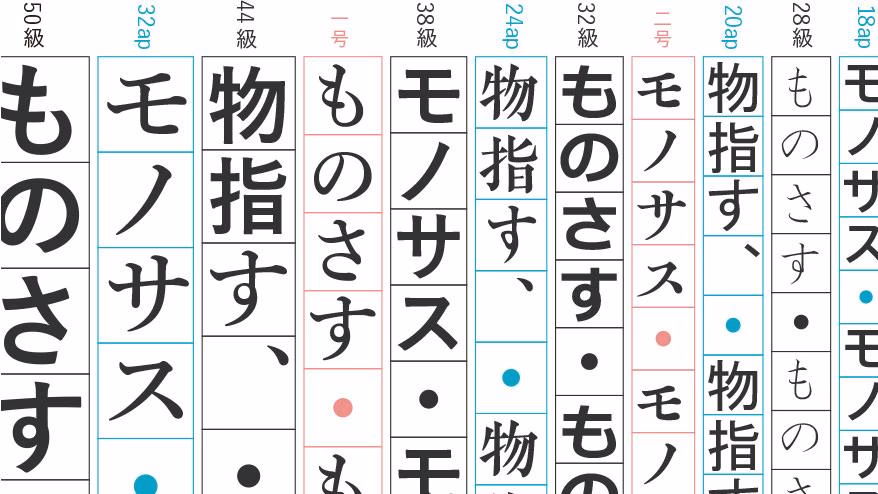
日本語はご存知のとおり、漢字とひらがな、カタカナの3種類の文字から構成されています。アルファベットであれば直線と規則性のある曲線で組み合わせれているので、文字組みのルールも設計しやすいですが、画数の差が大きく、形もさまざま日本語はなかなか大変です。日本語の文章は、いわば多様な人格をもったキャラクタ–たちがひしめきあっている感じで、こんな個性豊かなキャラ達を、一列に美しくに整列させるのは、なかなか難儀なことだなぁと改めて思います。
たとえば画数の多く、黒の密度が濃い漢字が隣り合っていれば少し間をあけたり、逆にふところ(文字を構成している画の内側の空間のこと)が広くて密度文字が続けば間を締める。
文字を面で見た時の黒の密度によって、隣り合う文字の空間を考えるので、組み合わせによってあらゆるケースがあり、丁寧にひとつずつみていく必要があります。
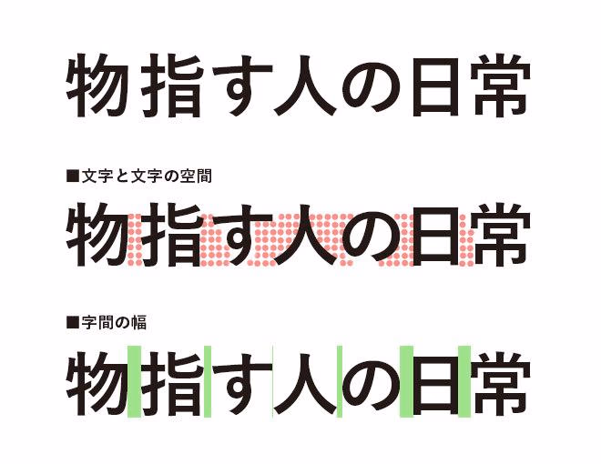
真ん中は文字どうしの空白の面積を表したもの。3段目は字間の幅をしめした。「日」などの縦線がサイドにあるものは広めの余白が必要となり、文字の間の空白が広いものどうしの字間は狭くしている。
そんな非効率的な日本語の文字を、欧文のように合理的な文字にしようと「カナモジ運動」が大正時代に起こりました。一字一音の表音文字であるカタカナのみで、全ての文書を作ろうという運動です。
この運動で叶えられたのは、たとえば、当時普及しはじめたタイプライターの効率化です。欧文のタイプライターであれば、アルファベット26字の組み替えで文書を作れますが、当時の日本語のタイプライターは2400字。とてもじゃないですが非効率です。それがカタカナのみで作ればキーも50個で済みます。
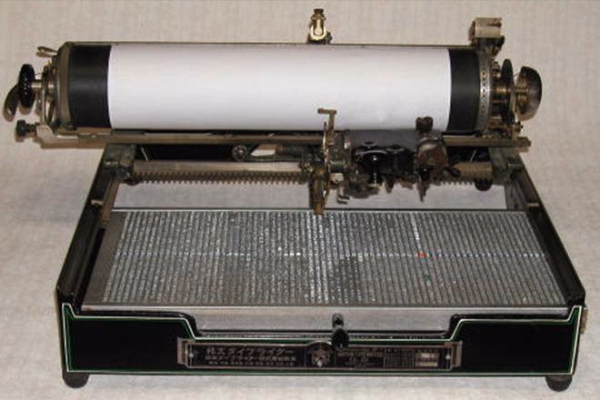
漢字の入った日本語タイプライター
By 橋本哲男 - Tetsuo Hashimoto (http://www.geocities.jp/kyo_oomiya/my.html) (http://www.geocities.jp/kyo_oomiya/jpntype.html) [CC BY 3.0 (http://creativecommons.org/licenses/by/3.0)], via Wikimedia Commons
ちなみにカタカナのみの場合は意味のまとまりが不明になるので、単語と単語の間にスペースをいれる(ワカチ書き)をルールとしました。
文字の幅が均等なカタカナ書体を使えば、文字間のルールも設計しやすく、きれいな文字組みができるでしょう。漢字を使った日本語より、ずっと効率的に文書が作れます。
ただしカタカナだけの文章は、ワカチ書きされているとはいえ、文章全体に抑揚がなく、ぱっと見で意味を読み取りづらいです。それが、漢字が混ざるだけでいっきに意味を理解しやすくなるのはなぜでしょうか。
次は、漢字を使った視覚的伝達と言葉のリズムについて考えていきたいと思います。
ビジュアル・コミュニケーションとしての
言葉のリズム
漢字とひらがなとカタカナの混ざった複雑な日本語。他国の人からみたら混乱していて非効率なだけな言語に感じるかもしれませんが、使い慣れてみると、意外に便利で、視覚的にもリズムをつけやすい言語であると感じます。
漢字は象形文字のひとつで、具象的で視覚的です。一目で意味を伝えるようなところは、ピクトグラムの延長線上にあるのではないでしょうか。
そういった意味で、漢字を使った日本語はビジュアル・コミュニケーションができる言語だと思います。
ビジュアル・コミュニケーションができる、つまり絵的に意味を伝達できるとしたら、文字のデザインは文章を書く時点から始まっています。読み手にどう伝わるかを意識するなら、文書を書く時点で見た目のリズムも考慮することが必要があるのではないでしょうか。
例えば、漢字とひらがなの組み合わせと量のバランス、句読点や段落が切られる位置で、同じ意味の文章でも印象が変わります。
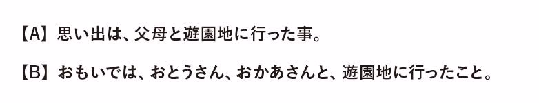
A はできるだけ漢字を使い、句読点の使用も最低限におさえた例。
B はひらがなを多用し、句読点もできるだけ入れた例です。
どちらが正しいというわけではないのですが、それぞれ書き方で見た目の印象も違います。Aの方がきっちりしていて、Bの方がおおらかな印象をあたえます。
これを、極端に単純化してみます。画数が多く密度の高い漢字を黒ベタの四角(■)、画数の少ないひらがなを白丸(◯)に置き換えたとすると以下のようになります。
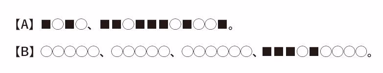
Aの方が黒の量が多く、ぎゅっと密度のあり、Bの方が軽やです。
見た目のリズムに関しても、Aの方が句読点が少なかったものの、■の漢字の塊が単語としてかたまりに見えるので、リズムがあり、Bの方はひらがなばかりで単語のかたまりが少なかったものの、読点が随所に入ることでリズムがとれています。
このように、文章の中の漢字の使用量や句読点の使い方ひとつで、伝わり方、コミュニケーションのあり方が変わるのです。
一方、文書をデザインする側としては、見た目のリズムをつけるために、文字の余白を設計します。
- レタースペース(字間)
- ワードスペース(語間)
- ラインスペース(行間)
- カラム間のスペース(段間)
これらの余白を、掲載されるメディアや用途、コンテンツ内容に合わせて設計します。
文書の余白と、先ほど述べた文書を書く側の文字選びのデザインも相まれば、文章全体にリズムをつけることができ、読みやすさを考慮できたり、意図したコミュニケーションに近づけることができます。
読みやすさの先の、表現する文字組みアート
「コンクリート・ポエトリー」
読みやすさを考慮したビジュアル・コミュニケーションとしての文字組みやデザインの先には、一歩踏み込んだ表現の世界、アートもあります。
「コンクリート・ポエトリー」もそのうちのひとつです。「コンクリート・ポエトリー」とは、タイポグラフィー的な字組みや言葉の組み合わせによって、文字をあたかも物質であるかのように視覚的にも意味をもたせた「詩(具体詩)」です。
見た目だけで言うと、2ちゃんねるなどでみられるアスキーアートも、ある種近いかもしれません(ただし使われている文字に意味が含まれていなければ、同義ではないと思います)。
例えば、昔見て印象的だった、山城隆一がデザインした植林運動のためのポスター「森・林」(1955年)(こちらのブログでも作品がみられます)も、コンクリート・ポエトリーにあたると考えます。「森」と「林」の大小サイズの漢字が敷き詰めらた様子が、言葉の意味以上に緑の鬱蒼としたイメージを彷彿とさせます。
ドイツのアーティスト、フェルディナンド・クリヴェット(Ferdinand Kriwet)の「見るテキスト」という作品は、何層もの円周上に文字が並んだタイポグラフィー(作品集の一部がリムアートさんのサイトで見れます)など、視覚的な文字組みの作品を作っています。
また、この分野で有名なのは北園克衛という詩人(『古書店パージナのブログ 』で作品がいくつかみられます)。最近の詩人で言うと、最果タヒさんのいくつかのインタラクティブな詩の作品も、この分野にあたるかもしれません。
その他、以前ものさす読書会であげられた、サルバドール・プラセンシア『紙の民』の文字組みも、コンクリート・ポエトリーのひとつだと思います。
これらの作品は、あたかもひとつのキャンパスに絵をのせるように、文字(詩)をのせ、その言葉と形からあらたな意味を創造しているのです。
このように、読みやすさを超えた表現の世界の文字組みも存在しています。
最後に
日本語は多様なキャラを持つ話からはじまって、その文字組みと言葉のリズム、最後は文字組みの表現の世界までお伝えしました。
Webサイトでは、現段階ですべての文字間を制御することは現実的ではありません。
共通のレタースペースや行間、マージンを設定し、あとは文章を流し込むレベルです。禁則処理もあまり期待できません。フォントもデバイスによって異なる場合が多く、文字をデザインする意味では紙よりも制御が効かないのが現状です。
それでも、メディアによって見せ方の特性がそれぞれ異なります。デザイナーは与えられた条件の中で、それぞれの特性にあった文字の見せ方を模索していきます。そしてこの先Webの文字組みも、技術やデバイスによってどんどん変わっていくことでしょう。
どちらにしろ、日本語の文字自体、複雑で豊かで視覚的な言語です。そんな日本語のデザインとは、おそらく文書を書く段階からはじまるのだと思います。そういった視点で、編集やデザインの仕事に関われたらと思います。

中庭 佳子