こんにちは。デザイン部の滝田です。
みなさんはいちからWebデザインに取り組む際、どの程度の工数や時間を割いて「カラー」の選定しているでしょうか。
私の場合、普段デザインをしていて「色」についての思考は至極シンプルにまとまってしまっていると思います。
「メインカラー」から中心に考えていきますが、たとえば企業(BtoB)のWebサイトの場合は、コーポレートカラーがあらかじめ決まっていて、メインカラーもそれになることが多いです。
次にそれにあった「アクセントカラー」を選定します。しかしこれもそう悩むことが多い作業ではありません。メインカラーの補色に焦点を当て、明度や彩度を合わせていく...という流れが一般的ではないでしょうか。
そしてベースカラーとなる背景には、ほとんどの場合何も考えずに「#ffffff(白)」を選びます。
色の選定でサイト全体のトーンも、ページから受ける印象も大いに左右されることは重々に理解していますが、実際は既存のルールに従い、リンク色やボタン色などあまり深く考えずに手を動かしはじめてしまっていることも多いなというように思います。
そういった既存のルール以外にも、「色」そのものにセオリーのような「共通認識」があるように思います。わたしたちはある程度「色のイメージ」を他者と共有して生活しているのではないでしょうか。
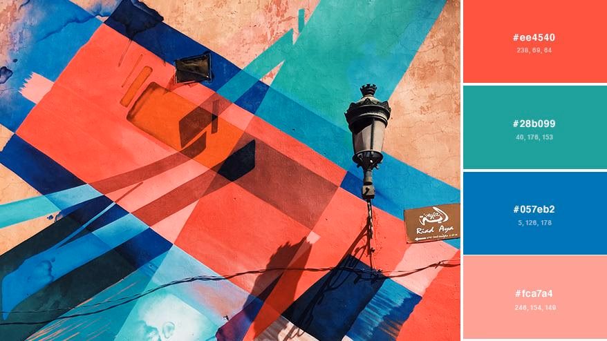
特殊な例を除いて、わたしたちは赤・オレンジ・黃をあたたかい色、青・紫をつめたい色として認識しています。
そこから例えば...
「赤」…情熱的・エネルギー・活動的・鮮やか・熱い
であったりとか、
「青」…清潔・誠実・クール・冷たい
など、この中に共感することのできるイメージがある方も少なくないのではないでしょうか。
この「共通認識」とは、わたしたちがふだんの生活の中で目にしているものに大きく影響を受けており、「文化的・社会的な要素から身についたイメージ」であるように感じます。
では逆に、われわれ人間が生物として、色から「心理的・生理的に感じとるイメージ」とは、どのようなものなのでしょうか。
そんな疑問から、一冊の本を読むことにしました。
フランスのカラーデザイナーであるジャン=ガブリエル・コースの著書、『色の力 消費行動から性的欲求まで、人を動かす色の使い方』を手に取りました。
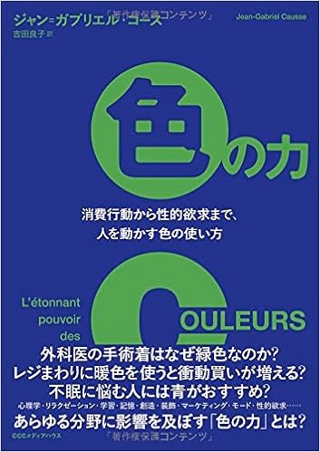
ジャン=ガブリエル・コース (著)、吉田 良子 (翻訳)『色の力 消費行動から性的欲求まで、人を動かす色の使い方』CCCメディアハウス(2016/5/27)( Amazon )
本書は、人間がいかに色から心理的かつ生理的に影響を受けているのかを、さまざまな研究や実験を用い解説してくれています。実験例の中には、乳幼児や人間以外の動物を対象にしたものや、国をまたいで行われたものもあり、幅広い範囲のデータを知ることができます。
簡単に納得できる色の特性から、驚きの検証結果まで、興味深い情報がたくさんありましたので、その中からいくつかの「色」を例にあげながらご紹介したいと思います。
1.赤

本書によれば、赤い色を見ると人は臆病になり、緊張を最大まで高めることができる色だといいます。
ちらっと赤を見ただけで、人間の脳幹は覚醒し、能力と行動に変化が生じるのだ。そして脳幹が優勢になると、我々はもはや論理に基づく知性ではなく、生存反応をともなう原始的な知能に支配される。
ジャン=ガブリエル・コース 著「色の力 消費行動から性的欲求まで、人を動かす色の使い方」CCCメディアハウス 2016年 第2章『色の与える影響』P63より
つまり人間はこの色を目にすることで、「恐怖心」を持ち「警戒」する傾向にあるということです。
この傾向は乳幼児を対象とした実験でも、同様のデータが見られたと記載されていることからも、色の特性は普遍的だということが有力に思われると記してあります。
またこの効果を別の角度から見ると、「赤」を自身が身につけることで、自分を相手よりも「優位」な立場としての印象を与えることができるということにも繋がります。
色彩の優位性に影響されるのは、人間だけではないということも本書で紹介されています。もちろん赤い色を感知することのできる動物に限りますが、「アトリ」という遺伝的に頭部の羽毛が赤と黒になる特徴を持つ鳥類を用いた実験では、黒い頭部のアトリが赤い頭部のアトリを見ると、ひどく怯え餌の前で争おうとしなかったといいます。これは頭部の色を塗り替えたりしても結果は同じで、赤い色の頭部になったからといって攻撃性が増すわけでもないそうです。
この実験結果を通して、このように結論づけています。
赤はこの色を身につける者に自信を持たせ、対する相手には恐怖心を抱かせることが推定される。
ジャン=ガブリエル・コース 著「色の力 消費行動から性的欲求まで、人を動かす色の使い方」CCCメディアハウス 2016年 第2章『色の与える影響』P70より
この「赤」の持つ影響力を知ることで、今まで用いてきたセオリーの中でなるほどと合致する点も思い当たりました。
フォームの送信ボタン、これは赤い色でデザインされているケースを多く目にしてきたように思います。個人情報を含む重要なデータを入力する箇所で「赤」を目にすることにより、われわれは「危機感」を感じ「注意深く」入力事項を見返し、送信へと進む効果が得られる可能性があるということになります。
また本書に出てくる実験の一つに、作業するPCの背景を赤・青の2色にした場合では、赤のほうが細部にまで注意が行き届き、そのPCで見せられた情報について後から正確に描写できたと綴られています。つまり、画面越しでも「赤の効果」が得ることができるであろうと思われます。
またそれとは逆に、気軽に押して欲しい「いいねボタン」や、場合によっては「カートに入れる」「注文にすすむ」ボタンは、緊張感を与えない別の色味を使用したほうがいいとも考えることができます。
2.青

先程PC画面の色の実験で「赤」と「青」が例にあげられましたが、「青」にはどのような特性が見られるのでしょうか。
本書では、創造力を大いに高められる可能性があり、アイデアを出したい時に好ましい色であると記述されています。
画面の背景を青にすると、単純作業がよくはかどる。だが、それ以上に、創造力が大いに高められる。
ジャン=ガブリエル・コース 著「色の力 消費行動から性的欲求まで、人を動かす色の使い方」CCCメディアハウス 2016年 第2章『色の与える影響』P74より
上記を証明する実験例は多いようで、あるブレインストーミングを行う際、またも赤・青の2色を背景色に設定したPCを利用した調査結果では、青い画面の使用者は創造性豊かなアイディアを、赤い画面の使用者は実用的かつ堅実なアイデアを出す傾向にあったといいます。
「青」は BtoB 向け企業の Webサイトのメインカラーとしての使用率が高く、個人的には「冷静」「堅実」「洗練」といったイメージがあり、「創造力をかきたてる色」であることは少し意外な印象を受けました。
昨今、ブレスト式の参加型イベントが増加しているように見受けます。こういった催しの制作に関わった際には、積極的に使うと効果があるかもしれません。Webサイトやプレゼン資料はもちろん、青い壁紙の会場を探してもいいですし、参加者であれば自分のノートPCの背景色を青にするだけでも効果が得られる可能性があるわけですから!
また本書には、「青」にまつわる興味深い話がもう一つありました。
「テキストリンク色」について、Googleが行ったテストです。2012年、世界中の検索エンジンに、50種類以上の青を使ったという実験です。この結果は公式会見で発表されているのでご存知の方も多いと思いますが、カラーコード「#1122CC」が最もクリック率の高い色と特定したそうです。またマイクロソフトの検索エンジンであるBingも同じような実験を行い「#0044CC」のリンク色を使用し、増収に成功しています。
われわれも知らぬうちに対象となっていたかもしれない実験で、同じ「青」の中でもほんの少し明度・彩度が異なるだけでクリック率ひいては収益に大きな影響を及ぼすほど、われわれは色に左右されると実証されているわけですから驚きです。
3.緑

「赤」「青」とくれば、Web制作に関わる者として気になる色は「緑」...ではないでしょうか。
「緑」といえば、自然色であるグリーンから連想する「リラックス効果」が第一に思いつきました。もちろんその効果も高く、また「青」同様に創造性高める特性もあるそうですが、本書では、以下の実験結果から「人を納得させる色」として紹介されています。
9カ国で行われた実験が記述されており、内容としては「中立的な意見」に関するアンケートの回答用紙の色味を変えることで、どこまで回答内容に影響があるかという調査結果についてです(「中立的な意見」に関するアンケートとは、あくまで「回答者にとってまったく興味のわかないこと」についてのアンケートだということです)。
回答用紙は青・黒・緑・赤の4種類であり、「賛成」「反対」「どちらでもない」のいずれかを記入するような形式で行われたようです。
その結果「どちらでもない」の回答は青・黒・緑に多く、赤は賛否に関わらず過激で極端な意見が多かったそうです。そして「緑」の色が与える影響力を、次のようにまとめています。
この結果で最も驚かされるのは、緑の用紙を用いた回答者の半数以上(五三パーセント)が、提示された文章に賛同していることだ。黒の用紙では三六パーセントにすぎない。緑は人を納得させる力が非常に強い色だと言えるだろう。
ジャン=ガブリエル・コース 著「色の力 消費行動から性的欲求まで、人を動かす色の使い方」CCCメディアハウス 2016年 第2章『色の与える影響』P83より
まったく興味がない質問とはいえ、意見を問われた際にも、色の影響をこれほどまでに大きく受けているわけです。
簡単なアンケートや大衆を対象にした意識調査は、様々な場所で目にしますが、その中には賛同的な意見がより欲しい場合も往々にしてあると思います。
そんな時、全体のトーン&マナーに沿った範囲で、フォントやボタン・アイコン色、または部分的な背景色等に「緑」を使用してみれば、また結果も変わってくるのではないでしょうか(回答者がまったく興味がなく、気分的な問題により賛否が分かれる場合であれば、ちょっとずるい気もしますが、ありな気もします)。
おまけ・ピンク

最後に、「そんな効果があったのか」と意外だった「ピンク色」の特性について触れたいと思います。
本書では「リラックス効果が確認されている色」として、以下の事例があげられていました。
ピンク色に関する実験は、驚くべき場所で行われていました。
アメリカやスイスにある監獄です。独房の壁をピンクに塗る実験で、どういった結論が出たのでしょうか。
このピンク色の独房に入れられた囚人は、一五分間もたたないうちに攻撃性が弱まり、与えられた作業も容易にこなしたという。さらに、独房を出たあとも、効果は少なくとも三◯分間持続したとされている。
ジャン=ガブリエル・コース 著「色の力 消費行動から性的欲求まで、人を動かす色の使い方」CCCメディアハウス 2016年 第2章『色の与える影響』P72より
またこの特性を利用している機関として、多動過多症候群の子供が通う学校などもあげられるそうです。
ピンク一色のお部屋を紹介する女子をテレビで見かけたときに「こんな部屋でくつろげるわけがない」という人もいると思いますが、実はそんなことはないのかもしれません。
彼女たちはあの部屋から高いリラックス効果を得ている可能性があるわけですから、そこで一緒に過ごすことで、最高にくつろげる至高の時間が待っているかもしれません。
まとめ
さまざまな調査・実験例により、人間が「心理的・生理的」に色から受ける影響とは、想像していた以上に「予想外の効果」また「その効果の大きさ」が多く驚かされました。
冒頭であげていた色のイメージからかけ離れた効果も多く見られたことから、「共通認識」はいかに「文化的・社会的」な影響を受けた印象であるかを知ることができました。
そして Web制作に活かしていくのであれば、以下の点に気を使っていきたいと感じました。
1.やっぱりセオリーも大事
この本を読み始めたとき、無意識に影響を受けている「心理的・生理的」な効果がおもしろく読み進めていました。しかし「その効果の大きさ」を知れば知るほど、逆に「文化的・社会的」な「共通認識」の重要性や影響力の大きさにも気付かされることになりました。
Web制作において重要な要素のひとつとして、「わかりやすい」ものを作るということを念頭に置くようにしています。
それは閲覧者が迷うことなく使用できるような導線であったり、ひと目で使用者の目的がどこで得られるかを発見できるような画面設計であったり、さまざまな点で気をつけるようにしています。
そういった観点で制作を考えていくと、一般的な「共通認識」に基づくいわゆる「セオリー通り」の色使いをすることへの重要性を無視することはできないと立ち戻ることになりました。
2.使う「時」と「場合」による
本書でも触れられていますが、色の影響は使われる「時」と「場合」に大きく左右されるということも、色を選ぶ際の重要なポイントのひとつです。
これに関しても、おもしろい事例が記載されていたので、紹介しておきたいと思います。
1993年にルノーが発売した小型車「 Twingo 」は「若者向け」であることを徹底し、革命的なデザインや刺激的な色を採用して、白・グレー・黒などスタンダードな色の生産は行わなかったそうです。しかし発売してみれば、それは派手な色の車に乗ることで若く見られたい「シニア層」に爆発的に受け入れられたようです。
また数年後、黒の車体を追加した際には、シックな色の車に乗ることを大人のステイタスとしたい「若者」が購入者の多くを占めていたのだから、ルノー側の発売当初の思惑とは正反対の結果になったという事例です。
さらに以下のように、結論付けられています。
色の重要度は、何よりも製品の種類に左右されると言わねばならない。
ジャン=ガブリエル・コース 著「色の力 消費行動から性的欲求まで、人を動かす色の使い方」CCCメディアハウス 2016年 第2章『色の与える影響』P143より
大衆を対象にした例でなくとも、いくらオレンジが大好きだからといって、全身オレンジのコーディネートで街へ繰り出す人はかなり少数派ですよね。
つまりその場に「好ましい色」は、「時」と「場合」により変化するものということになります。その色を使用する箇所の「狙い」と照らし合わせて、適切であるかを思考を凝らすことが大切であると考えられます。
3.トレンドも取り入れる
本書には、車やファッションなど「社会的な価値を持つ」消費ほど色が重要視されることが多いとの記述もあります。
これらの売上にはトレンドが大きく関わっていると思われますし、もちろん Webコンテンツも同様です。
今っぽく見えるものは、「何色なのか」「明度や彩度はどれくらいなのか」さらには「どのような組合せで使われているのか」「どんな箇所に使われているのか」。
どれほど「心理的・生理的」な影響力が期待できる色使いであっても、「文化的・社会的」な「共通認識」として確立できている色合いがあったとしても、それが正解であるとは限りません。
ユーザーにこの Webサイトを「体験」したいと思わせられるかどうか、これにはしっかりとトレンド色を把握して、今っぽく見える色彩を使用することもとても有効な手段だと思います。
いかがでしたでしょうか。
この記事でデザインの中で使うことを前提として、「色」の影響力について書いてまいりましたが、この本の中には職場や普段の生活空間で使える色彩の知識や、対人関係に効果がありそうな色の使い方など、いますぐ試してみたいと思える情報も数多く仕入れることができました。
改めて興味深い分野だなと感じたので、今後も知識を増やしてデザインの向上にもつなげていきたいと思います。