Hello. I'm Onogi, the head of the design department.
Adobe XD (Adobe Experience Design) was released as a preview version last year. It has now (as of March 2017) been upgraded and is even easier to use.
Adobe XD is an application that allows you to quickly create mockups and prototype designs. It is very light and intuitive, and I feel that it will become a mainstream tool for web design and UI/UX design in the future.
The features and detailed instructions for using it are introduced on the official page and other blogs, so this time I would like to talk about the benefits and points to be aware of when introducing it into an actual project.
How I came to use Adobe XD
The design department had been looking for a more efficient way to create designs and mockups for some time. Now that responsive design has become mainstream, web design requires flexibility, and design comps for a variety of devices are becoming necessary. At the same time, the amount of work required has increased significantly, so we wondered if there was a tool that was more intuitive and would allow us to focus on UI/UX (User Interface/User Experience)? That's when Adobe XD came along.
At the time, there was talk within the company about launching a website for the Food Hub Project , and we thought, "This is a good opportunity to try it out in practice!" That's how we got started.
When I actually used it, I noticed some great benefits as well as some points to be aware of.
Advantage 1:
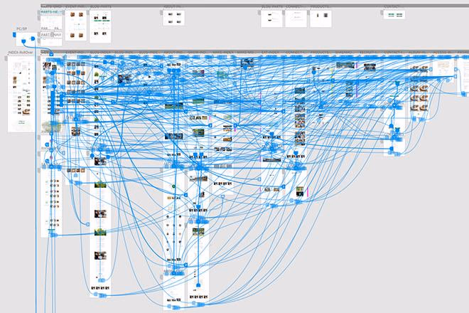
All page designs in one file.
This time, the number of pages was 30 pages + parts, so it wasn't that many, and I lined up all the PC and smartphone designs in one file. The convenience of being able to check other pages at any time and the smooth process of copying and pasting to reduce and adjust the design for smartphones have greatly improved my work speed.
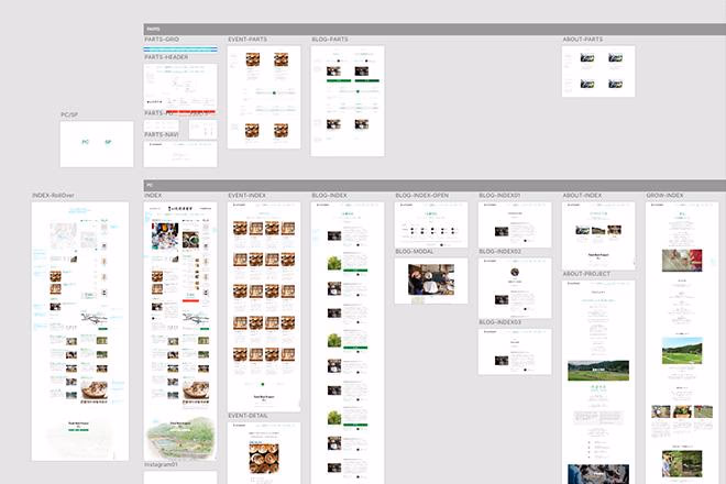
Each page is arranged hierarchically and parts are grouped together, making it possible to quickly review the design of other pages.
Nowadays, Photoshop also has artboards, so you can line up designs and view them in a list, but as the number of designs increases, it becomes heavy and frankly difficult to use. However, Adobe XD is incredibly light, as all images except for bitmaps such as photos are vectors like illustrator. And it runs fast!
Being able to design without stress is a big advantage.
Advantage 2:
Speed with online sharing.
Since we were building a website for the Food Hub Project, we needed to coordinate the design with the manager, Manabe, but since Manabe lives in Kamiyama, Tokushima Prefecture, we expected there would be very few opportunities for us to meet face-to-face since I was in Tokyo.
The online sharing function proved extremely useful. It was possible to share the design we were currently creating online, and the speed with which we could instantly reflect and share Manabe's comments, even though he was far away, was incredible.
for example,
Manabe: "I wonder what it would look like if I packed the typesetting in a bit more tightly?"
Me: "Yes, I've compressed it. What do you think? It definitely looks more chunky now and is easier to read."
In this way, we were able to quickly reflect and decide on changes by simply looking at the shared design URL.
I feel like it's very useful in many situations, such as reviewing designs with internal colleagues or mass-producing large-scale websites.
Note: As of March 2017, this online sharing does not have a password protection function. Anyone can see the link, so be careful.
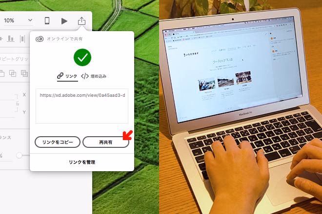
You can issue a preview link from the button in the top right of XD. By simply sharing it, anyone can view it at any time. There is also a comment function for the design. It's like a live design!
Advantage 3:
Since you can actually navigate between pages, there is little difference in usability after coding.
Probably the biggest benefit.
The prototype function allows you to link any part to the design of another page. In other words, you can actually navigate around the website. Of course, it is reflected in the online sharing mentioned above, so you can have people check it with an impression close to the state after coding, which can prevent you from thinking, "Hmm? Maybe it's a bit hard to use?" after coding.
Manabe, who was checking the design, said, "It's completely different from looking at each piece of paper or data one by one like before. It's much easier to visualize and you can notice even the smallest details in advance, so it's really good!"
It's not possible to set up rollovers or complex motions, so I'd like to see this implemented in the future, but I still feel that it's a big advantage as the accuracy is significantly improved compared to before.
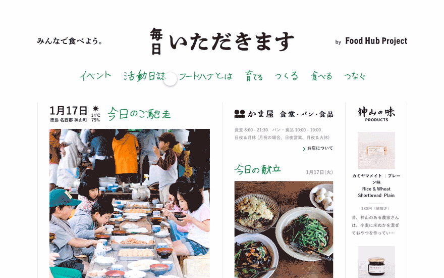
A prototype screen generated from XD. You can navigate through pages like this as if you were actually visiting the site, which makes it easy to consider the UX of the entire site.
However, it's not really a disadvantage, but linking is quite a difficult task... Since it's about 30 pages responsive, I managed to manage it, but if there are a lot of pages, I felt that it would be necessary to make an effort and ingenuity to improve the accuracy with a minimum number of links.
XD's link lines run freely between pages. For large-scale websites, you should carefully consider how much prototyping you need to do!
summary
What did you think?
Even if you're not a designer, you may find it beneficial. I'd like planners and directors who have the opportunity to create wireframes to try it out. (The feel is similar to PowerPoint or Keynote, so it's intuitive and easy to use!)
Currently, there are other UX design tools that can be used for prototyping, but the fact that Adobe released it was a big reason to choose it. After all, I have been designing with Adobe products up until now, so I was hoping for a link with those products...
To be honest, there are cases where other companies have better prototyping functions, but I think that as a UX design tool, it is one of the easiest to use.
Even though it's so useful, it's still in beta. I'm looking forward to seeing how much it will evolve when it becomes a production version.
This is for designers!
XD design tips.
1. Measure the distance between objects
You can do this in Photoshop, but you can't measure unless you have the guides displayed in Photoshop. To be honest, guides are a nuisance when you're looking at the tone of a design. In XD, you can always check the other object by simply holding down the option key and hovering the mouse over it, which is very convenient.
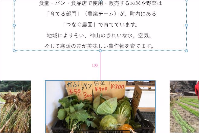
The pink number "100" above is the distance (px). You can easily check the distance between the text and the photo, so there is less fluctuation in the margins throughout the whole design, making it easier to set rules.
2. How to manage images with XD
First of all, you can't edit images with XD. You can't edit photos or cut paths like you can with Photoshop. It's a UI/UX design tool after all.
Therefore, image data reflected in the design must be managed externally. I prepared something like an image folder for each page and managed the PSD data and JPG data of Pothoshop.
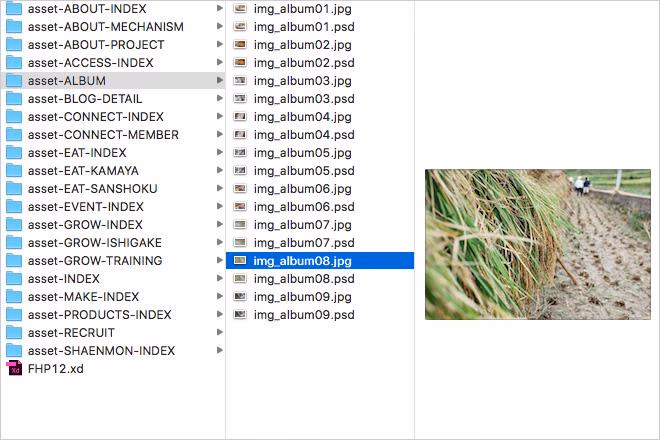
The "FHP12.xd" on the bottom left is the original XD design data. This contains the designs for all pages. I created an image folder called "asset-page name" to manage the images.
So, what is the advantage of this? The designer will inevitably prepare a "maximum size" image that is responsive, so the coder doesn't have to worry about the size of the image when actually coding. "PC design, tablet design, smartphone design... which data image should be sliced to look the best?" You don't have to think about that. You can just use what's in the image folder.
3. Pixel Grid Alignment and Points to Note
This is something that Adobe may improve in the future, but because XD is made up of vector data, it is not always possible to design pixel-perfectly for every step of the process. For example, when selecting multiple objects and scaling them down at the same time, the coordinates and dimensions will have decimal points.

This makes it difficult for coders to decide on the size, and for designers to measure the margins. Above all, it makes the design data look messy.
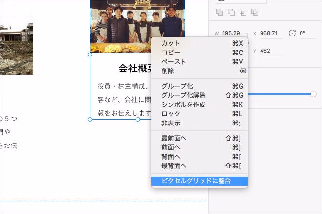
In that case, right-click and select "Align to Pixel Grid".
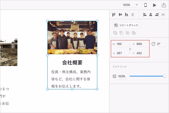
The decimal points disappear instantly, creating beautiful numbers and pixel-perfect data.
However, there is a caveat. If you apply "Align to pixel grid" to a vector image created in Illustrator or other software...
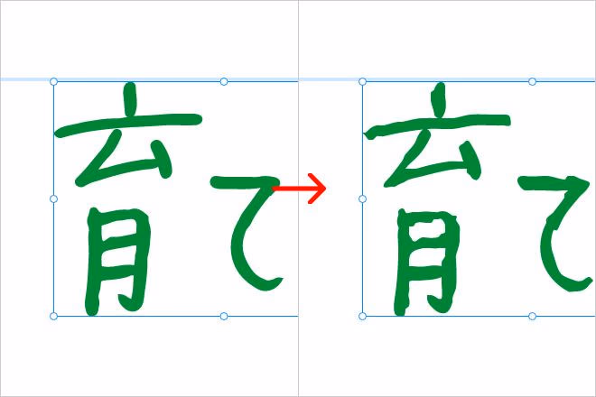
It will be very jagged. This is because the anchor points you hold will also be misaligned when they are aligned. Therefore, I recommend that you use it after checking whether the data you want to integrate contains any vector data designs.

モノサスアーカイブ