私たちコーディングファクトリー(略してCF)のコーダーは、普段ガイドラインをきっちり守りながら、個々人のスキルや知識もどんどん取り入れてコーディングしています。
そういった日々の仕事の中で生まれたこだわりやアイデアは、何時間でも語れるほど。
これまで「コーディングメソドロジー」では、コーディングファクトリーのコーダーたちの個々の仕事術やコーディング技術を紹介してきました。
第4回となる今回はいつもと趣向を変え、「余白(margin)をとる位置」について、コーダーそれぞれの意見を出し合った対談の様子をお届けします。
まず、対談を始めるにあたり、以下のチームに分けました。
当初ははっきりと、セクション・モジュール間マージンを「上につける派」「下につける派」に分けようとしたのですが、
「でも、どっちも使うんだよなあ。ハイブリッドだよね」
ということで、「基本的にどうとるのか?」で分けることにしました。
「基本、上に取る派(margin-top派)」
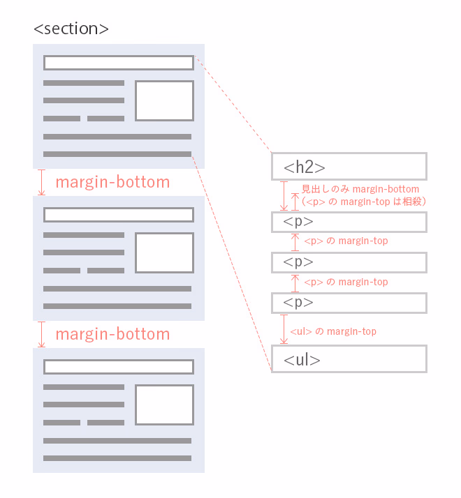
…ページを作るときに、モジュール間やセクション間など、基本的にmargin-topで余白を取る。
児嶋・松原・奈須
「基本、下に取る派(margin-bottom派)」
…同じく、基本的にmargin-bottomで余白を取る。
菅野・丸山
「臨機応変派」
…デザインなど様々な要件を考慮して適宜決めていく。
加藤・岡村・岩崎
自己完結で綺麗に終わりたい。
「基本、上に取る派(margin-top派)」の、その理由
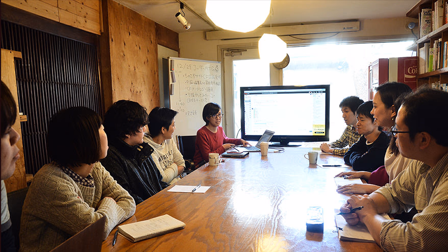
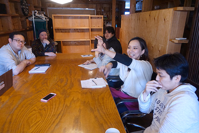
手前左から…私・田中、「上派」の児嶋・奈須・松原。奥左2番目から…「下派」菅野・丸山、「臨機応変派」岡村。
ー「基本、上に取る派(margin-top派)」(以下「上派」)の皆さん、その理由としてどんなことがありますか。
松原 IE8では:last-child擬似クラス(※1)に対応していないので、ブラウザ対策のためにも上マージンでとるようにしています。たとえばリストだったら、<li>にmargin-top:10px;と余白をとり、IE8も対応している:first-child(※2)を使って、一番最初の<li>にでmargin-topを0にするとか。
※2 :first-child擬似クラス…自身の親要素の最初の子要素。詳しくは:first-child - CSS | MDN
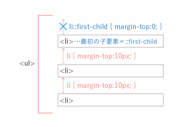
松原の意見。<li>に上マージンを設け、一番最初の<li>でマージンを打ち消す。
児嶋 下にマージンをとるようにすると、たとえば一つのセクションがものすごく長くなった時、その次のセクションとの間のマージンが、ちょっと考えづらい。このセクションのすぐ上のマージンが知りたいのになあ、って。上にマージンを取るようにすると、そこがクリアになって、設定がしやすいです。
ただひとつ例外があって、見出しは下でとるようにしています。
松原 見出しの後には必ず何か要素が続きます。見出し以外の要素は、下に何も他の要素が続かない場合がありますよね。その場合、最後の要素の下に余白は必要ないので、上に余白をとると綺麗に終われるんです。
児嶋 自己完結ですよね。要素がみんな自分で、自分の上の要素との間につくマージンを持っているので、いつ誰がいなくなっても大丈夫という。その余白は誰のものかを考える。
「基本、下で取る派(margin-bottom派)」の論
ー「基本、下で取る派(margin-bottom派)」(以下「下派」)の皆さんはどうでしょう。
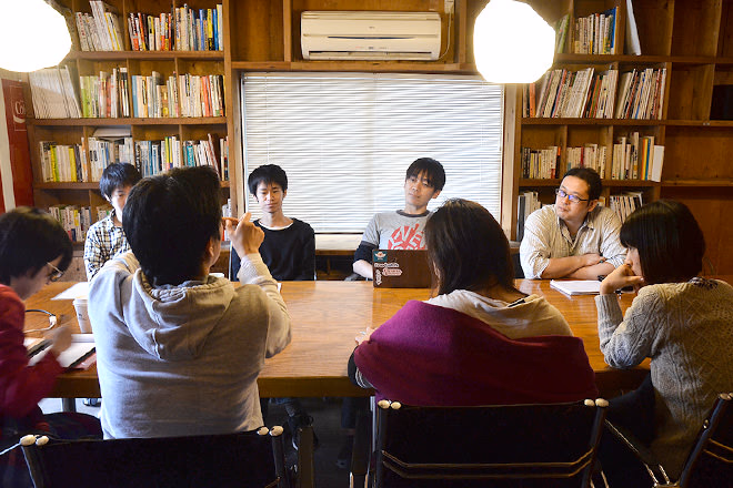
中央左から菅野・丸山。
菅野 セクションのことを考えると、僕も上にマージンを取らないわけではないです。僕は、セクションは上に、その他のモジュール下にとる、という風にやっています。「その余白がどのモジュールの、どこについているのか?」っていうことを考えたときに、やはり下についていることが多いと思うんですよ。
たとえば見出しの下の余白は「見出しの下の余白」であって「見出しの次の要素の上についた余白」ではないんじゃないかと。
で、セクションはなぜ上につけるかというと、HTML5のセクショニング(※)を考えたとき、セクションを入れ子にすると、下には余白がとれないので。
大事なのは「それは誰が持っている余白なのか?」ということだと思います。
丸山 Webページを見るとき、上から下に見ていくのが人間の自然な視線の流れだと思うんです。そうすると、素直に要素の下に余白をとっていった方が、パーツをどんどん下に足していくときに考えやすいし、見やすい。ただ、僕も上に絶対マージンをとらないのかというと、そうではないです。隣接セレクタ(※)を使うときは、その特徴として下の要素にしかCSSが効かないということがあるので、そのときはmargin-topを使います。
「ものさすサイト」のココ、
自分ならどう余白をとるか
菅野 何かデザインを出してもらった方が、話しやすいと思うんですけど。
ーじゃあものさすサイトの、記事ページでいきましょうか。
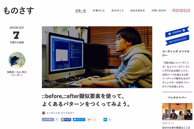
「コーディングメソドロジー」第2回・丸山の「::before,::after擬似要素を使って、よくあるパターンをつくってみよう。」
ーこの部分について、いかがでしょう。
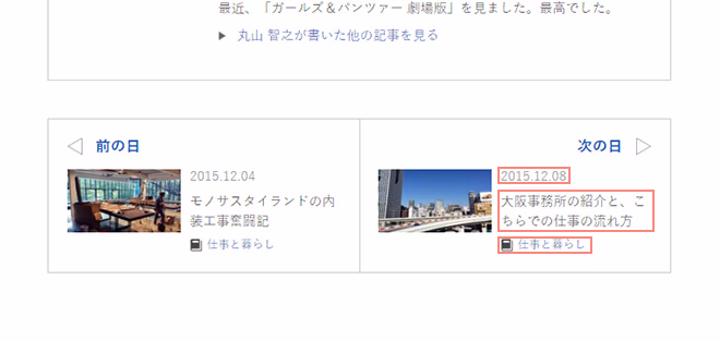
記事ページ最後尾にある、「次の日」の記事へのリンクモジュール。ここから議論は赤枠の3つの行の余白の取り方へ…
菅野 「2015.12.08」の下の余白も、「大阪事務所~」の持っている余白なんですか?
松原 そうですね。下派の方は日付の下につける、と。
菅野 下に余白をつけて、すべて最後の「仕事と暮らし」に:last-childを使って処理すればいいと思います。見出しは下なのに他は上って、どうして混ぜるんでしょう?そこは統一した方がいいと思うんですが。
松原 私は「その余白が誰のものなのか」よりも「どういう意味のある余白なのか」、その余白があることによってデザインで何を表しているのか、が重要だと思うんです。
たとえば「2015.12.08」で言うと、その後に要素が続く場合には余白をとる必要があります。でも単体でいる場合には、そもそも余白がいらない。
最初からCSSに書かなくてもいい余白じゃないかと。
児嶋 汎用性の問題もあります。もしも「大阪事務所~」のタイトルが2つ連続する場合には、「大阪事務所~」に同じクラスをつければ、上に同じ余白をとれるようになります。でも「2015.12.08」の下でマージンをとってしまうと、「大阪事務所~」の下にも別でマージンを設定しなければいけない。
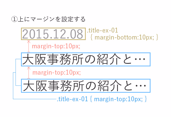
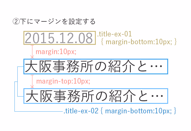
児嶋の論を図にしました。上にマージンを取るようにすると、必要なクラスは1つだけ(①)、でも下にとると(②)最低2つは必要になる。
というわけで、上にマージンを取っていた方が汎用性が高いのではないかと。
一律して「:last-child」で打ち消すのもいいとは思うのですが、それがどこまで有効なのか、というのはありますね。
案件によって統一することが大事
ー 議論が白熱してきましたね。最近入社組の皆さんは、先輩方の議論を聞かれてどう思いましたか?
岡村 皆さん、余白ひとつとっても、明確に自分の中にコーディングのルールを持っているんだな、と感じました。私はあまり決めていないつもりだったのですが、基本的にマージンは下にとって、適宜上にもとるというようにしているので、自分の中にもルールはあったのかなと、改めて思いました。
ー 加藤さん・岩崎さんは?
加藤 どっちとも決めてないんです。皆さんに合わせます。
(一同・笑)
岩崎 僕も案件リーダーに従います。奈須さんがリーダーの案件の時に「マージンは全部上にして」と指示を受けたときもそうしました。
今はまだ、自分がこれって思っても、上から言われたら…
(一同・笑)
菅野 本来は下派ってこと?
岩崎 はい、セクションやモジュールは下に余白をとります。ただ、その中で<p>などテキストが連続する場合は、ただ並べるだけで適切にマージンがついていくので、上に余白をとるようにしています。
でも、上派か?下派か?って聞かれると迷いますね。どっちも使うので…
奈須 でも、それが一番いいかもしれないですね。お客様から頂くデザインでは、<section>などの外側の要素は、並びに規則性がある場合が多いので、それは下にマージンをとって:last-childで処理する。
でもその中の要素は、並びに規則性があるとは限らないから、上でマージンをとっていった方が安全かな、と。
<section>など、外側を囲むブロックとなる要素は、多くのデザインで同じマージンを開けて並ぶのでmargin-bottom。中に入る<p>や<ul>の要素は、その場所の意味によって余白が違うので、margin-top。
奈須 上にマージンを取ったときは:first-childで、下にマージンを取ったときは:last-childで余計なマージンを処理しますよね。でも、その上や、もしくは最下部に何か要素が入ってしまうと、どちらもうまくいかなくなる場合がある。…どちらも一長一短ですね。
ただ、どちらかに統一した方がいいのかなとは思います。
菅野 完全に統一するのは難しいですが、複数人数で作業する場合など、コーディングしていく上でマージンを取るときの「基本」が上なのか、下なのか、っていうのは決めておいた方がいいですね。
コーダーを操るのはデザイナー!?
松原 デザイナーさんの中にも「下派なのかな?」って方はいますよね。
少し前に出た<p>と「関連情報」ボックスとの余白が、<p>に合わせて10pxになっていたりとか。そういう場合は「そう組んだ方がいいかな」と考えて、下派になります。
児嶋 それ、デザイナーさんに聞いてみたいですね!デザインするとき、余白は上でとるようにしているのか、下でとるようにしているのか。デザイナーさんのマージンルール。
菅野 コーダーって基本的にデザインによって変えますもんね…
あれ?もしかして僕たち、デザイナーさんに操られてるんじゃないの!?
(一同・笑)
ー デザイナーがすべてを握っていると。
松原 だから私たちがこんなに惑わされてる(笑)。
菅野 今すぐ聞いてみたい。僕たちはそれに合わせます、コーダーはどっちでもいい、自分を持ってないので(笑)。
(一同・笑)
奈須 いやいや、そうじゃないんですよ。
私たちは「コーディングのプロ」だから、どちらにも対応できるんです。
菅野 確かに。
おお、きれいにまとまった(笑)!
(拍手)
終わりに
結果、「デザイナーはどうしてるか聞いてみよう!」という、思わぬところで収束しました。
「余白」、上で取るのがいいのか下で取るのがいいのか。結局答えはありません、でもそれでいいんです。
答えが無いから追求できる。これからも考えていくことができる。
そして「自分なりのベスト」を仕事に活かすことができるのです。
今回は聞き役に徹した私ですが、次はぜひとも議論に参加したいと思います。
さて、次はみんなで何を話そうかな…。
田中