こんにちは。クリエイティブ部運用チームの松永です。
ウェブページ運用の中でも制作(コーディング)をメインで行っています。
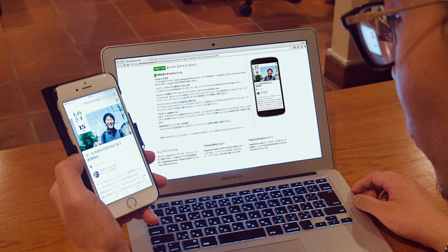
今年を振り返ってみて、スマホサイトの改善のご依頼が多かった一年だったかと思います。
お客様からも、PCよりスマホからのアクセスのほうが多くなってきたため、スマホサイトに本腰を入れて改修をすすめたいというご希望をちらほら聞きました。
ご存知の方も多いとは思いますが、今年の4月頃から、GoogleがWEBページのスマホ最適化の推奨を始め、モバイルフレンドリーという言葉が作り出されました。
モバイルフレンドリーとはWEBサイト・WEBページがスマートフォンやタブレットなどのモバイル端末での表示に最適化=スマホ対応していることです。
Google検索のアルゴリズムにも、わずかながらモバイルフレンドリーの影響があるようです。
あなたのスマホページは何点でしょうか。
スマホ化対応がどれだけ進んでいるかを計測する一つの方法として、PageSpeed Insightsとというアプリケーションサービスがあります。
PageSpeed Insightsは、Googleが提供している、「スマホページの点数を出してくれる」ウェブアプリで、スマホページの「速度(ページの読込スピード)」と「ユーザーエクスペリエンス(ページ利用者が体験すること)」の二つの観点から各100点満点で採点してくれます。
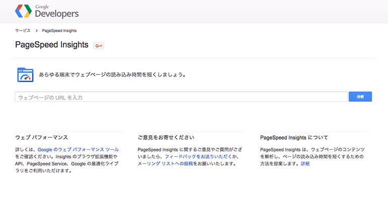
PageSpeed insights
https://developers.google.com/speed/pagespeed/insights/?hl=ja
スマホページを改善しよう
お客様よりスマホ最適化対応の一環としてPageSpeed Insightsの点数アップのご依頼もいただきました。その際にスマホの最適化は具体的にどうやってやるんだろうかと調べました。
基本的にはデータの軽量化なのですが、ブラウザのキャッシュを使ったり、CSS/JS読込方法を工夫したりと様々でした。
そのなかでも比較的やりやすい方法をお話します。
スマホの改善 その1
画像圧縮 ~速度~
画像圧縮ツールのJPEG MINIやPNG MINIを使用して画像を圧縮していても「修正が必要」と警告が出ます。
なぜだろうと調べたところ、JPEG MINIやPNG MINIは基本的な圧縮と呼ばれており、高度な圧縮「ロスレス圧縮」をする必要があるということがわかりました。
ロスレス圧縮とは
「データの欠落がまったく起こらない圧縮方式のこと」です。
ロスレス圧縮の簡単な方法としては、PageSpeed Insightsで計測後に出てくる以下のリンクからダウンロードすることです。
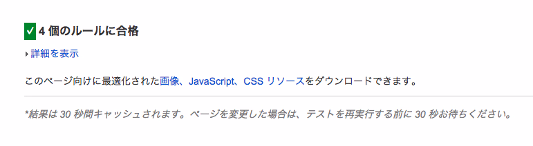
ダウンロードしたファイルをアップするとPageSpeed Insightsでの警告が出なくなりました。
このリンクは非常に便利なのですが、大きすぎる画像を圧縮した際に画像サイズが小さくなることがありますのでご注意ください。
スマホの改善 その2
ブラウザのキャッシュを活用する ~速度~
ブラウザキャッシュとは、ブラウザにファイルを一時保管する機能です。キャッシュにデータが存在している間は、ページへアクセスした際、キャッシュを読みこむようになります。
ブラウザキャッシュを有効にさせるには.htaccessに以下の記述を加えることでキャッシュを設定できます。
Header set Cache-Control "max-age=2592000, public"
簡単にコードの説明をします。
「Files ~ 」では、どの拡張子のデータをキャッシュに保存するか選ぶことができます。
上記の例では、「gif, jpeg, jpg, png, ico」が対象となりますので、CSSやJSを加える場合、こちらで加える事が可能です。
「max-age=2592000」で、キャッシュに保存する有効期限を設定できます。
数字の部分は秒数ですのでこちらを変更すれば、キャッシュへ保存する期間を決定できます。
スマホの改善 その3
コンテンツのサイズを表示域に合わせる
~ユーザーエクスペリエンス~
PCサイトでは、コンテンツをpx(ピクセル)で幅指定していると思いますが、スマホでは、ピクセル指定していると、端末によってはコンテンツが表示幅からはみ出してしまい、コンテンツが見切れることがあります。コンテンツが見切れてしまうと、ユーザーは画面をスクロールしなければ見られなかったり、CSSの設定によってはコンテンツが表示されない場合もあり、快適なブラウジングが出来ません。
サイズを表示域に合わせるためにリキッド化
リキッド化することでコンテンツのサイズを表示域に合わせましょう。
コンテンツ幅を「px」で指定するのではなく「%」で指定してする必要があります。
リキッド化の作業は、「px」で幅を指定しているものを「%」にどんどん置き換えていくことですが、リキッド化の作業を始める前にしておいたほうがよいことがあります。
「box-sizing」を「border-box」に指定する
    * {
      box-sizing: border-box;
    }
CSSの説明をしますと、「box-sizing」とは要素のサイズを指定方法を設定するプロパティです。
「box-sizing」を「border-box」で指定した場合は、サイズの指定にborderとpaddingを含みますので、borderやpaddingをpxで指定していたとしても、幅を%で計算しやすくなります。
そのため、まずリキッド化の前に、CSSの最初の行に「box-sizing: border-box;」の記述を加えましょう。
ちなみに、現在(2015年11月)における、多くのブラウザでの「box-sizing」の標準設定は「content-box」です。「content-box」は、サイズの指定にborderとpaddingを含みません。
「box-sizing」の準備ができたら、ひたすら画像やコンテンツの幅を「%」に変換しましょう。
以上、3つの改善点について説明しましたが、その他にも改善点のヒントがPageSpeed Insightsを使うことで見えてきます。
点数ばかりを追えば良いというわけではないですが、PageSpeed Insightsをスマホ最適化のひとつのバロメータにしてはいかがでしょうか。
ユーザーがブラウジングしやすくするために、できることはやるスタンスでスマホページの改善に取り組みましょう。

松永 悟