こんにちは。デザイン部の滝田です。
私はWebデザイナーになる前、アパレル業界で販売員として働いていました。今では考えられませんが、当時はいわゆる“モテ系ふわふわフリフリ”の格好で店頭に立っていました。そのせいかモノサス初出社日に、代表・林から「モノサスっぽくないね〜!」と突っ込まれた私ですが、今日ではすっかり溶け込んでいるかと思います!
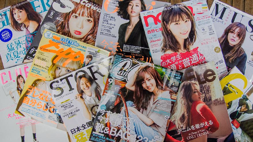
入社後はさまざまなジャンルのデザインに触れてきましたが、個人的にはやはり、女性向けの華やかなデザインに目がいくことが多いです。最近は、待望の女性向けファッションアイテムのバナー制作を任せてもらえるようになったこともあり、いつも以上に「女性らしいデザイン」への関心が高まっています。そこで今回はWeb制作をする際にも参考にすることが多い「女性ファッション誌」のデザインに焦点を当て、販売員時代に読みまくった経験を活かしつつ、デザイナー目線で分析してみたいと思います。
まずは、女性ファッション誌をグループ分けしてみる
女性ファッション誌と一口に言っても、テイストの幅は広く、書店には様々な系統の雑誌が並んでいます。とにかく数が多いので、まずはテイスト・ターゲットを軸にグループ分けしてみました。
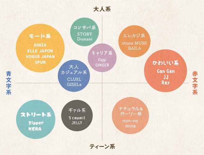
※デザイン面で分析するため、便宜上このようにグループ分けしています。月毎に内容も変わるため一概には言えませんが、その点ご了承ください。
縦軸をターゲットの年齢層、横軸をファッションテイストとして、いったんこのようにマッピングしました。ここでいう「赤文字系」「青文字系」の定義は、以下のようになっています。
赤文字系:フェミニン系のきれいなお姉さんファッションを指します。
モテ系という言葉がよく使われますが、赤文字系雑誌の中にもかわいいスタイル・かっこいいスタイルなど住み分けがあったります。
青文字系:個性的なおしゃれを好む原宿系ファッションなど、赤文字系と逆の特徴を持つスタイルを指します。今回の分類では、対モテ系という意味合いで、モード系・カジュアル系ファッションも青文字寄りの系統として扱っています。
この分布図上で近しい系統の雑誌を一括りにして、以下の9グループに分けました。このグループごとにデザインの特徴をみていきたいと思います。
1. popでカラフル!ティーン向けの「ストリート系」
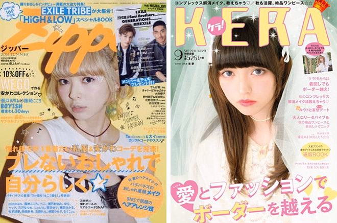
『Zipper』 2016年8月号 祥伝社出版(Amazon)(左)
『KERA』 2016年9月号 モール・ オブ・ティーヴィー出版(Amazon)(右)
10代〜20代前半向けの、原宿系ストリート雑誌。パンク・ゴスロリ系のファッションも掲載されていて、個性派好きのティーンから支持されています。
表紙のモデルイメージと同様に、誌面もpopでかわいいディテールが施されたタイポグラフィや、カラフルなテクスチャーが満載です。余白はほとんどなく、ステッチ、袋文字、テクスチャーなど、何かしら装飾が敷き詰められています。
また1ページ内の画像数はかなり多く、モデルさんの切り抜きカットやアイテム画像がふんだんにつめ込まれています。このゴチャっと感、原宿竹下通りで見かける人気ショップの雰囲気そのものですね。
フォント:
基本はゴシック体。他にも手書きフォントやデコラティブなフォントが多用されている。
カラー:
複数の彩度が高めの色がカラフルに組み合わされている。
レイアウト:
1ページ内に多くの要素を詰め込み、盛りだくさんな印象をあたえている。
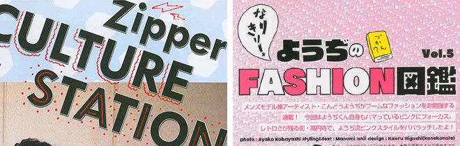
『Zipper』 2016年8月号 祥伝社出版 2016/6/23発刊 P76「Zipper CULTURE STATION」より抜粋(左)
同紙P84「なりきり!ようぢのFASION図鑑 vol.5」より抜粋(右)
2. 好感度高め女子!「ナチュラル&ガーリー系」
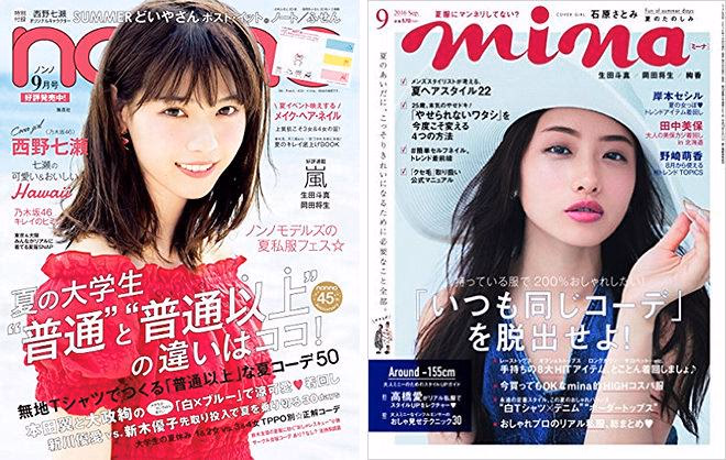
『non-no』 2016年9月号 集英社出版(Amazon)(左)
『mina』 2016年9月号 主婦の友社出版(Amazon)(右)
10代後半〜20代向け。女の子らしい、やりすぎない「おしゃれ」を紹介しています。爽やかで清潔感のあるフェミニン系のコーディネートを紹介しています。
画像の数は多めですが、装飾はシンプルにすることでナチュラルな印象にまとめてます。キーアイテムの文字色を変えたり、色ベタに白抜き文字にしていることが多いです。背景に色を敷いているページも、柄物ではなくパステルカラーのベタ塗りでガーリーなイメージに。
フォントは細ゴシックを文字間広めに使用することで、女の子っぽさが出ます。
またモデル写真は公園を思わせるような緑をバックにしたロケーションが多く、爽やかな印象を与えています。
フォント:
全体を通して、ほぼゴシック体のフォントを使用。細字で文字間広め。
カラー:
使用色は多いが、いずれもパステルカラー。文字色で彩度の高い色味を使うことで、ティーンの元気な印象を加えている。
レイアウト:
所狭しと写真が並んでいるが、ストリート系よりもモデル写真の扱いが大きめ。
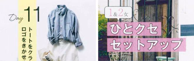
『non-no』 2016年9月号 集英社出版 2016/7/20発刊 P48「夏の大学生 “普通”と”普通以上”の違いはココ!」より抜粋(左)
同紙P85「1&2 vs. 3&4 大学生の夏休みTPPO正解コーデ」より抜粋(右)
3. 辛口セクシー!肌見せ多めの「ギャル系」
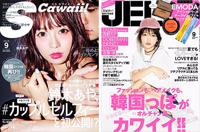
『S Cawaii!』 2016年9月号 主婦の友社出版(Amazon)(左)
『JELLY』 2016年9月号 ぶんか社出版(Amazon)(右)
10代後半〜20代のギャル向け雑誌。かつてギャルといえば黒肌でしたが、現在では美白でナチュラルメイクのモデルさんばかりです。原色ばかりの派手な印象はなくなりましたが、肌見せの多さは健在です。
ウエイト重めのフォントで黒文字を使っているページが目立ちます。これによりページの印象を引き締め、コントラスト強めのくっきりとした雰囲気になっています。基本的に黒文字が多いのですが、タイトルにちょっとクセのある書体を使用することでアクセントになっています。(ギャル系雑誌は「黒文字系」と呼ばれることもあります。)
ところどころに筆記体の英字が装飾として使われていて、クールなイメージになっています。
フォント:
こちらもゴシック体が基本だが、タイトルにちょっとクセのある書体でアクセントをつけている。また、ウエイトは重め。
カラー:
黒と白をベースにポイントで彩度の高いさし色が入る。
レイアウト:
モデルさんのカットの他に、商品カットの切り抜き画像が多めで、ストリート系同様、ごちゃっとしている。
『S Cawaii!』 2016年9月号 主婦の友社出版 2016/8/6発刊 P20「理想はちょっと不良なオンナノコBAD GiRLY]より抜粋(左)
同紙P83「黒とデニムが主役のNewシンプル」より抜粋(右)
4. 赤文字モテ系!フェミニンスタイルの「かわいい系」
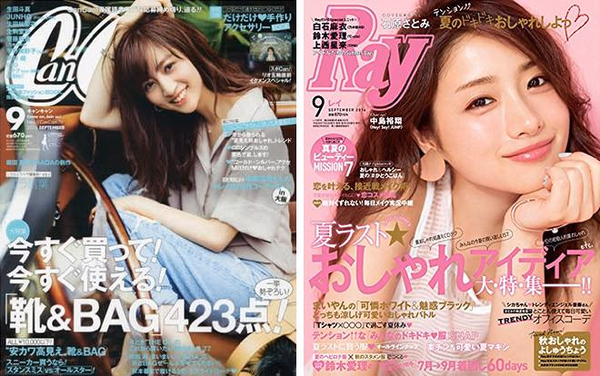
『CanCam』 2016年9月号 小学館社出版(Amazon)(左)
『Ray』 2016年9月号 主婦の友社社出版(Amazon)(右)
20代中心向けのフェミニン系代表の雑誌。オフィスシーンでもプライベートでも甘めの「愛されコーデ」が中心ですが、最近はカジュアルなスタイルも多く掲載されています。
商品カットと説明文のテキスト数が多く、特にシューズやバッグなどのアイテムは、余白ギリギリまでぎっしりと画像が並んでいます。この情報量の多さが、まさに赤文字系っぽさでもあります。
文字のウエイトは細めでエレガンスな雰囲気ですが、装飾の色使いは意外とビビットで華やかさも忘れません。また背景色のない吹き出し表現が多用されています。
フォント:
タイトルもテキストも、基本的にはゴシック体を使用。特集系ページでは、写真の雰囲気に合わせて明朝体をつかっている箇所も。文字のウエイトは細めでエレガンスな雰囲気。
カラー:
白をベースとして、水色系でまとめているページ、ピンク系でまとめているページと、それぞれ切り替わっていくイメージ。
レイアウト:
とにかく商品カット数が多い。特にシューズやバッグなどのアイテムは、余白ギリギリまでぎっしりと画像が並び、情報量が多い。
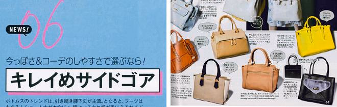
『CanCam』 2016年9月号 小学館社出版 2016/7/23発刊 P53「2016A/W 『靴&BAG』はこうなる!超速NEWS」より抜粋(左)
同紙P62「リアル”THE OL”に聞いた!本当に欲しい靴&BAGはコレ!」より抜粋(右)
5. オンもオフも!OLさん向けの「キャリア系」
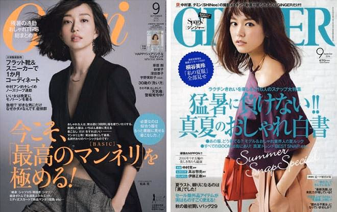
『Oggi』 2016年9月号 小学館出版(Amazon) (左)
『GINGER』 2016年9月号 幻冬舎出版(Amazon)(右)
20代後半〜30代のOL向け雑誌。知的でシックな要素を取り入れた、働く女性のためのコーディネートを提案しています。
1ページまるっと1カットで使用するなど画像の扱いが大きく、アイテムのみのページも掲載数をしぼっていてかなりすっきりと見せています。
見出しのカラーはネイビーやパープル、エンジなど落ち着いた色味が使用されています。暗めの濃い色味をポイントで使うことで、ページの印象を引きしめパキッとしたイメージに仕上がっています。
罫線使いなどオーセンティックでシンプルなあしらいが多く、画像の彩度もおさえめで、全体的にシックな印象にまとまっています。
フォント:
タイトルは明朝体フォントを使用している箇所が多い。
カラー:
全体として彩度をおさえていて、落ち着いた雰囲気にまとまっている。見出しのカラーはネイビーやパープル、エンジなどいずれも落ち着いた色味。暗めの濃い色味をポイントで使うことで、ページの印象を引きしめている。
レイアウト:
1ページにつきまるっと1カットのように、画像を大きく扱うページがほとんどで、余白も多く、かなりすっきりと見せている。写真の面に文字を乗せるバランスがスタイリッシュ。
『Oggi』 2016年9月号 小学館社出版2016/7/28発刊 P69「今こそ『最高のマンネリ』を極める!」より抜粋(左)
同紙P176「フェミニンorクール?秋色メークの正解、教えます!」より抜粋(右)
6. ファッションも暮らしも品よく「コンサバ系」
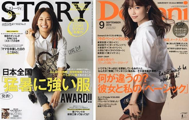
『STORY』 2016年9月号 光文社出版(Amazon)(左)
『Domani』 2016年9月号 小学館出版(Amazon)(右)
30代後半〜40代向け。上品なエレガント&カジュアルスタイルを紹介しています。またファッションだけではなく、ライフスタイルやグルメの要素が多めです。
目立っていたのは、文字間を狭めで大きめな明朝体の縦書きタイトル。下の世代の雑誌にはないスタイルです。
掲載アイテム数はやや多めですが、目の流れが意識されていて読みやすい並びになっています。
またベーシックな色のスタイルが多いため、装飾で使われる色味を増やすことで華やかな印象にしています。しかし彩度の低いやさしい味を使用することで、派手になりすぎず、うまく調和させています。
フォント:
見出しは明朝体で、縦書きのタイトルが多い。縦書きの文字間狭めで、フォントサイズが大きい。
カラー:
ベーシックな色のファッションスタイル多いせいか、全体の色味の印象として彩度低め。ベージュや紺などよく使われている。ポイントで彩度の高めな色も使われている。
レイアウト:
こちらも写真の扱いは大きめだが、キャリアと比べるとアイテムの掲載数はやや多い。目の流れが意識されていて、メインの写真からアイテムの画像への流れが気持ちいい。
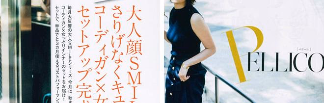
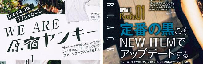
『STORY』 2016年9月号 光文社出版2016/8/1発刊 P124「ヴァンヌフとコラボ!大人顔SMILEがさりげなくキュートな、コーディガン✕女っぷりトップスのセットアップが完成」より抜粋(左)
同紙P136「靴ブランドの新御三家って知ってる?」より抜粋(右)
7. 上質志向のオトナ女性向け「エレカジ系」
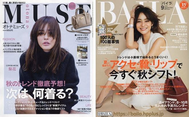
『otona MUSE』 2016年9月号 宝島社出版(Amazon)(左)
『BAILA』 2016年9月号 集英社出版(Amazon)(右)
30代後半〜40代前半がターゲット。大人世代の上質なおしゃれを紹介していて、ブランドジュエリーや小物の掲載も多いです。また最近流行りの豪華付録の先駆けは、「otona MUSE」だと言われています。
明朝体のフォントが主ですが、見出しやあしらいに使用しているゴシック体とのバランスがいいです。基本的にモノクロの色使いで、画像の色味が引き立っています。
また人物の写真は特に明度・彩度とも低めで、おしゃれだけど日常的な自然体を意識している感じです。商品画像やグルメのページなんかは明度が高めで、メリハリがあります。
装飾は細めのラインを一本入れるなど、シンプルにすっきりと見せています。
フォント:
明朝体のフォントが主だが、見出しやあしらいに使用しているゴシック体とのバランスがよい。
カラー:
タイポグラフィは基本的にモノクロの色使いで、画像の色味を引き立たせている。
レイアウト:
アクセサリーやシューズの写真も大きめに扱ってることが印象的。比較的小さな画像は並びを整頓され、すっきり見せる工夫がある。
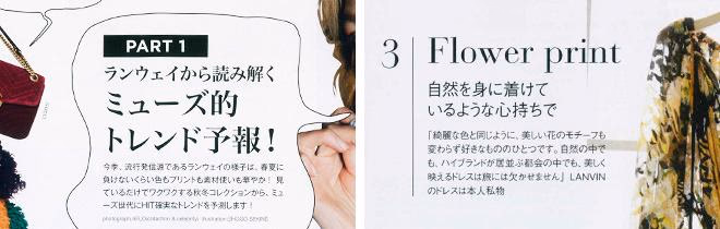
『otona MUSE』 2016年9月号宝島社出版 2016/7/28発刊 P34「WHAT’S THE NEXT TREND秋のトレンド徹底予想!次は何を着る?」より抜粋(左)
同紙P46「MY STANDARD スタイリスト7人に聞く、『私の永遠の定番』」より抜粋(右)
8. 海外スタイルに敏感な「大人カジュアル系」
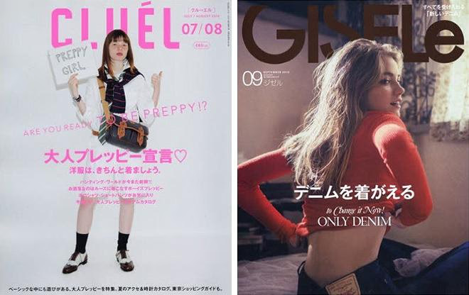
『CLUEL』 2016年7・8月合併号 ザ・ブックスパブリッシング出版(Amazon)(左)
『GISELe』 2016年9月号 主婦の友社出版(Amazon)(右)
20代〜30代向け。どちらもカジュアル思考の雑誌ですが、「CLUEL」は上質ベーシックにこだわるナチュラル系。「GISELe」は海外セレブをお手本にした辛口な最新スタイルを掲載しています。
この2冊、写真の撮り方がとても印象的です。海外モデルさん自体がさまになっているということもありますが、顔への光の入り方や背景の影の使い方に注目すると、うまいなぁと常々思います。
画像とテキストの配置バランスや余白の使い方、シンプルでガーリーなタイトル装飾も参考になります。雰囲気に合わせた英字フォントのチョイスも◎
フォント:
海外トレンドの最旬スタイルを紹介しているので英字の表現も多く、見出しもあしらいもゴシック体がほとんど。中央寄せの見出しテキストが多い。
カラー:
白地の背景にシンプルな黒字の見出しで、商品画像を目立たせている。背景色を使っている箇所も、薄めのグレーやベージュなど馴染みの良い色合い。
レイアウト:
「CLUEL」の商品画像のならべ方は独特で、Webページのように整列しているページが印象的。「GISELe」は画像の扱いが大きく、インスタグラム風の写真の上にテキストを重ねている。
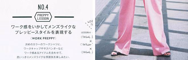
『CLUEL』 2016年7・8月合併号 ザ・ブックスパブリッシング出版2016/6/20発刊 P64 「Are You A Preppy? 定番シャツをプレッピーに着る方法」より抜粋(左)
『GISELe』 2016年9月号 主婦の友社出版 2016/7/28発刊 P95 「『新色の合わせ方』今から着たい新し い色のベーシック服」より抜粋(右)
9. 最旬トレンド満載の「モード系」
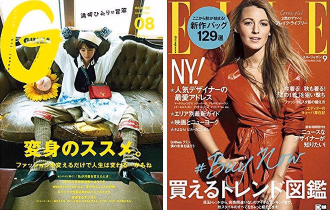
『GINZA』 2016年8月号 マガジンハウス社出版(Amazon)(左)
『ELLE JAPON』 2016年9月号 ハースト婦人画報社出版(Amazon)(右)
モード誌なので、幅広い年齢層を対象としています。コレクション雑誌に近いので、流行を1年先取りできます。専門性も高く、ファッション業界の方や専門学生にも読者は多いです。
分類としてはコレクション雑誌に近いので、アーティスティックでブランド色の強いページもあります。
専門性が高く、トレンドの考察や説明など文章量が多いですが、画像とテキストをはっきりと区分している場合が多いです。画像のイメージを大切に扱っていることが伺えます。
また文字の向きを逆にしていたり、見出しにイラストを使用したりと、その他の雑誌には見られないような、思い切った表現も多いです。
フォント:
基本的にはゴシック体を用いているが、ページの雰囲気に合わせて様々なフォントが使われています。見出しには明朝体が使用されていることが多い。
カラー:
白地に黒文字が主だが、ビビットなポイントカラーが目立つ。
レイアウト:
画像とテキストをはっきりと区分しているレイアウトが多い。ブランド色の強いカットが多いので、画像のイメージを大切に扱っていることが伺える。
『GINZA』 2016年8月号 マガジンハウス社出版 2016/7/12発刊 P142「Go! Continuer! メガネの野望」より抜粋(左)
同紙P150「1枚でサマになったら、最強サマー!Tシャツを着る日、私だけのメイク」より抜粋(右)
まとめ:女性ファッション誌から見えてきたデザイン表現
各誌、テイストやターゲット層にあわせて、それぞれデザイン表現が異なりますが、全9グループの分析をすることにより、以下のような傾向が見えてきました。
フォント:
赤文字系ではウエイトの軽めな細字がほとんど、青文字系はさらにウエイト重めの文字も使用することでメリハリをつけている。またティーン誌はほぼゴシック体を使用しているが、ターゲット層があがるにつれて明朝体のフォントが増える傾向にある。また縦並びの文字表現も使用される。
カラー:
これは発売日の季節にも大きく左右されるが、特に文字の使用色として赤文字系は暖色、青文字系は寒色の使用率が高いと感じる。モード系やストリート系など個性的なファッションを提案している雑誌は、ビビットカラーをポイントで使用してページにアクセントをつけている。
レイアウト:
ティーン誌と赤文字系は、画像の掲載量が特に多く余白の少ない印象。それとは逆にターゲット層高めの青文字系は、写真の雰囲気の重きをおいていて画像は大きめで、掲載量は少ない。余白を大きく使用している箇所も多い。
今までファッションアイテムにばかり目を取られていましたが、こうして読み込んで見ると、それぞれのテイストに合わせたデザイン表現が施されていることに改めて気づきました。各雑誌のデザイン性を分析しマッピング化したことにより、今後のWeb制作において、ターゲット層にぴったりと合った参考となる雑誌を詳細に絞り込むことができそうです。
これからは、ファッション誌など誌面からもアイデアやヒントを得ることにより、タイポグラフィーや色使いなど「女性らしいデザイン」の表現を応用して仕事に活かしていきたいと思います。